
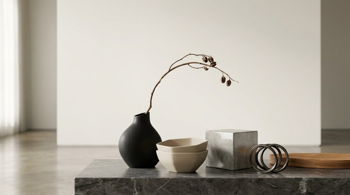
You have cleared your surfaces. You have chosen pieces that hold meaning. Yet the room still feels flat. Something is off. The truth is, arranging minimalist objects is an art form. It is not about having less. It is about placing each piece with intention so that it earns its spot. When done right, a single ceramic vase or a sculpted chair can change the entire energy of a room. This guide will show you how to arrange minimalist objects for maximum visual impact, turning your space into a gallery of calm.
Arranging minimalist objects is about creating relationships between form, space, and light. Use the rule of three to build natural groupings. Respect negative space as an active design element. Choose a focal point and let everything else support it. Practice the edit: if an object does not add visual weight or quiet beauty, remove it. The goal is a composition that feels inevitable, not crowded.
The Foundation of Minimalist Object Arrangement
Before you move a single item, understand the principles that guide every decision. Minimalist arrangement is not random. It follows a logic rooted in how our eyes travel across a room.
Start With the Negative Space
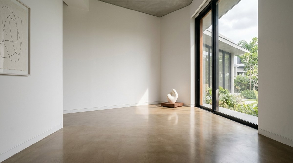
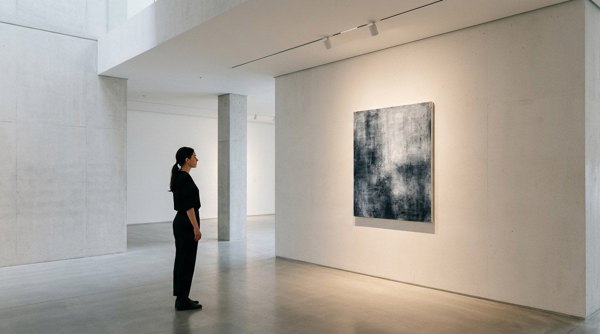
Negative space is the empty area around your objects. It is not dead space. It is breathing room. Without it, even the most beautiful vase looks like clutter.
Think of negative space as a frame. A painting needs a border to be seen clearly. Your objects need the same. When you place a sculpture on a console table, the empty inches on either side are part of the composition. If you crowd the table, you lose that frame.
For a deeper look at how emptiness shapes design, read about why empty rooms speak louder than full ones. It will change how you see your own home.
The Rule of Three in Practice
Groupings of three objects feel complete to the human eye. This is not a hard rule, but it is a reliable starting point for minimalist object arrangement.
Here is how to build a trio:
- Vary the height. A tall floor lamp, a mid-height stool, and a low plant create a natural staircase for the eye.
- Vary the texture. Pair a smooth ceramic piece with a rough woven basket and a matte metal object.
- Keep the color palette tight. Stick to one or two neutrals. Let texture do the work.
A trio should feel like a conversation. One object leads. Another responds. The third anchors the group. If you find yourself adding a fourth piece, ask why. Often, three is enough.
A Step-by-Step Process for Any Surface
You can apply this method to a shelf, a coffee table, or a windowsill. The steps are the same.
- Clear the surface completely. Start with zero. This forces you to be intentional about what returns.
- Choose your hero piece. This is the object with the most visual weight. It could be a large ceramic vessel, a framed print, or a sculptural lamp.
- Add one supporting object. This piece should be smaller and different in shape. It complements the hero without competing.
- Add a functional object (optional). A stack of books, a tray, or a candle. Keep it simple.
- Step back and look. Check the negative space. If the grouping feels tight, remove something. If it feels disconnected, adjust the spacing.
- Edit again. Wait 24 hours. Come back and see if the arrangement still feels right. Remove anything that feels like noise.
This process works because it builds in an editing step. Most mistakes come from not stepping back. For more on curating what you display, see how to curate a minimalist gallery at home.
Techniques for Maximum Visual Impact
Now that you have a process, let us look at specific techniques that make an arrangement sing.
The Art of Asymmetry
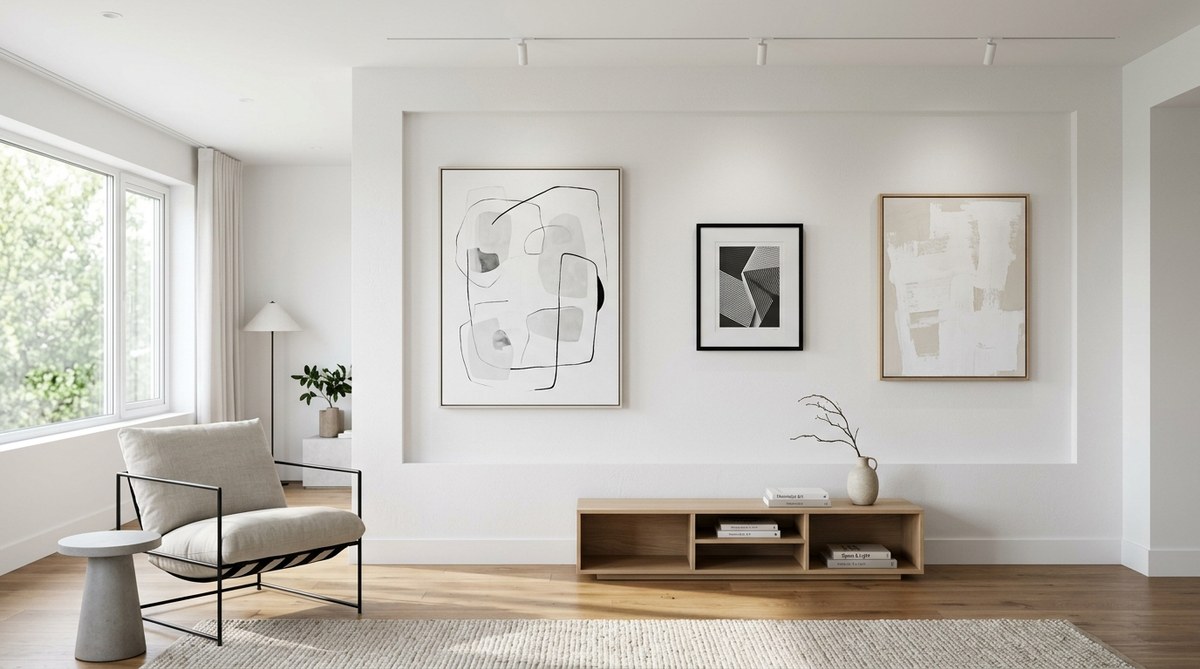
Symmetry can feel formal. Asymmetry feels alive. Place a tall object on one side of a shelf and balance it with a cluster of small objects on the other side. The visual weight is equal, but the arrangement has movement.
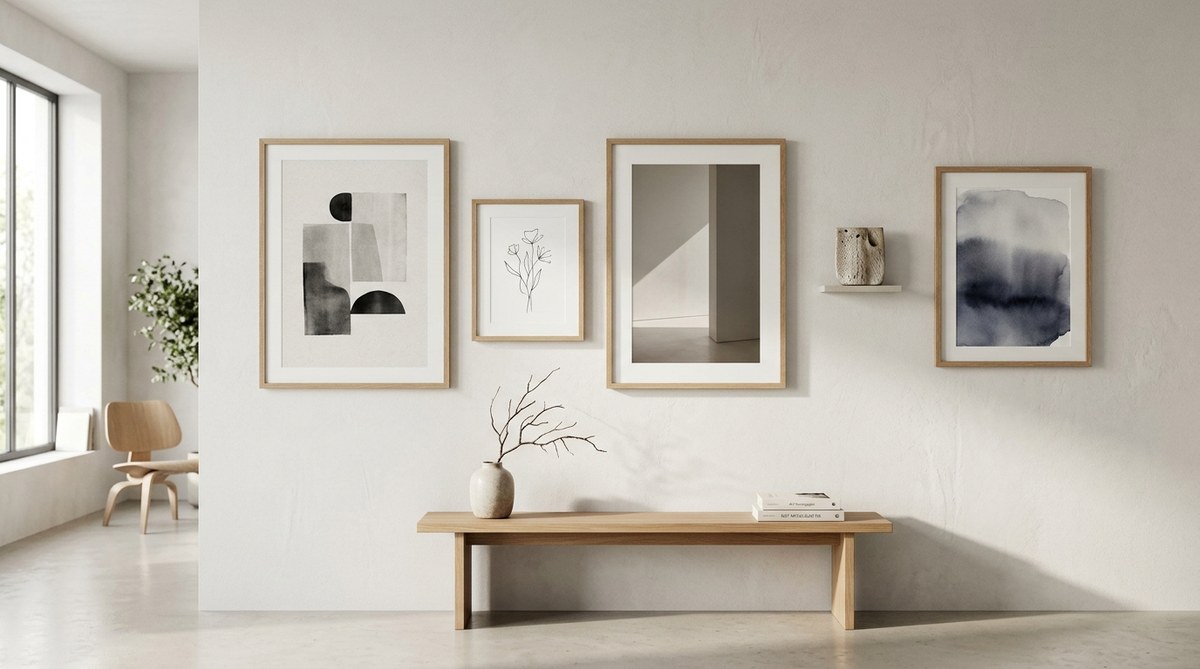
For example, a large branch in a ceramic vase on the left side of a mantel can be balanced by a stack of three books and a small stone on the right. The shapes are different. The weight is not. That tension creates interest.
Use Light as an Object
Light is not just illumination. It is a design tool. Place an object where it catches morning sun. Watch how the shadow changes the form. A simple glass cube can become a projection of light across a wall.
If you have a room with limited natural light, use a directed lamp to cast a shadow. This turns your object into a dynamic piece that changes through the day. For more on this idea, check out how to use minimalist light design to enhance your gallery experience.
Create a Visual Path
Your eyes should move across the arrangement in a natural line. This is often a zigzag or a curve. Avoid placing objects in a straight horizontal row. That stops the eye.
Arrange items so that your gaze moves up, down, and across. A low plant, a mid-height book stack, and a wall-mounted print create a vertical line. That is more engaging than three objects at the same height.
Common Mistakes and How to Fix Them
Even experienced designers make errors. Here is a table of the most frequent mistakes in minimalist object arrangement and the simple fix for each.
| Mistake | Why It Happens | The Fix |
|---|---|---|
| Too many objects | You want the surface to feel full | Remove half. Then remove one more. |
| All objects are the same height | The eye gets bored | Add a tall object or a short stack of books. |
| No negative space | You pushed items together | Spread them out. Leave at least 2 inches between objects. |
| Objects clash in color | You mixed warm and cool tones | Stick to one color family. Use texture for contrast. |
| No focal point | Everything competes | Choose one hero piece. Let others recede. |
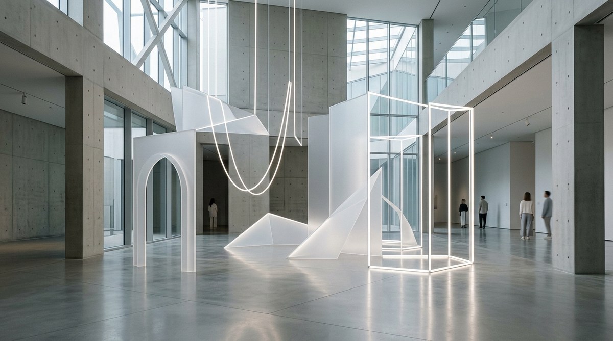
If you recognize your shelf in this table, do not worry. Minimalist arrangement is a skill. It improves with practice. Read more about the impact of object simplicity on modern art installations to see how professionals handle these choices.
Expert Advice on Editing Your Objects
“The most important skill in minimalist design is the ability to walk away. You do not need to fill every surface. You need to trust that the empty space is working for you.” — Axel Vervoordt, interior designer
This quote captures the hardest part of minimalist object arrangement: restraint. It feels unnatural to leave a table bare. But that bareness is what makes the objects you keep feel special. Every piece becomes a deliberate choice.
Tying It All Together
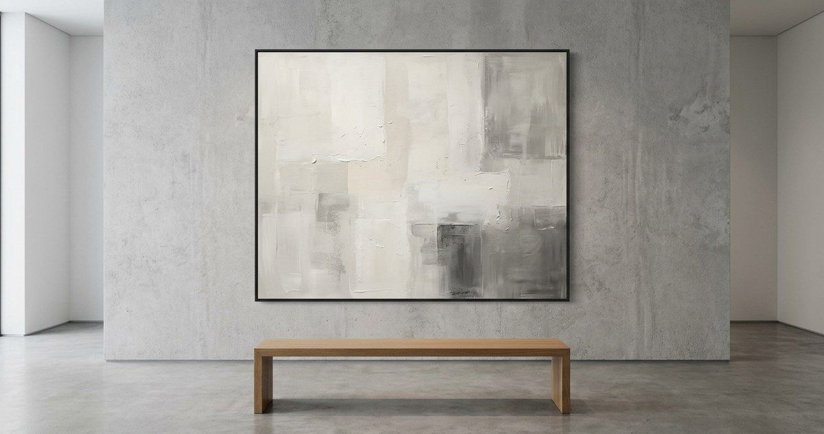
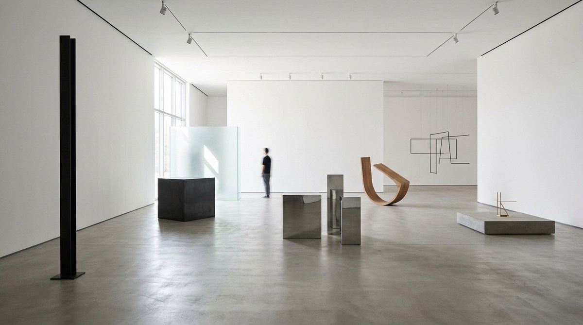
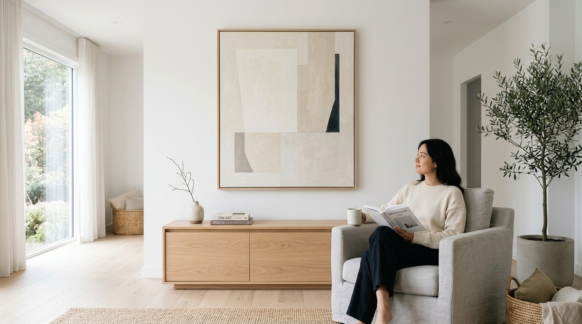
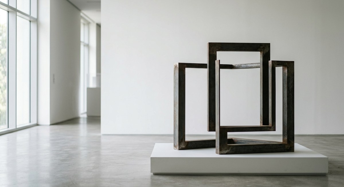
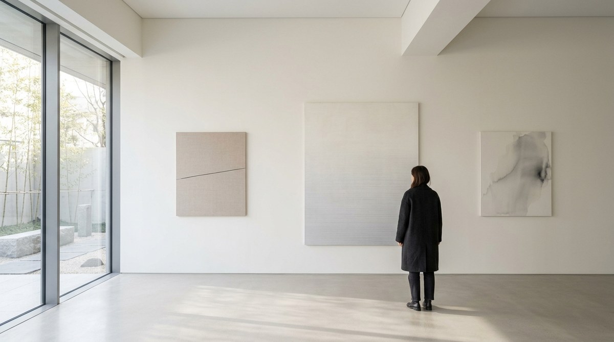
Think of your home as a gallery. Each surface is a pedestal. Each object is an artwork. The space around it is the frame. When you honor that frame, your objects gain presence.
Start with one surface. A bedside table or a kitchen counter. Apply the step-by-step process. Use the rule of three. Respect negative space. Step back. Edit. Then leave it alone for a day.
You will be surprised at how a single, well-placed object can change the feeling of an entire room. For more inspiration on this approach, see how minimalist art cultivates mindful living spaces.
Let the Room Breathe
Minimalist object arrangement is not a one-time project. It is a practice. As you live in your space, you will notice when something feels off. A new book arrives. A plant grows. A season changes. That is your cue to re-edit.
Keep the process simple. Clear the surface. Choose your hero. Add one or two companions. Step back. Remove what does not belong. Repeat.
Your home should feel like a sigh of relief. When you walk in, your shoulders drop. That is the goal. That is the power of placing objects with intention. Give it a try on one shelf this weekend. See how it feels. You might find that you do not want to add anything back at all.

Leave a Reply