
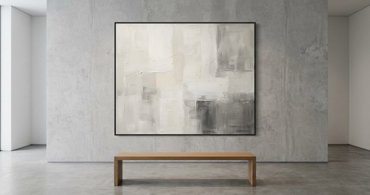
A single brushstroke of deep indigo on raw canvas. A room painted entirely in shades of warm ivory. These moments stop us. They ask for nothing but our full attention. That is the quiet power of a monochromatic palette in minimalist art. By stripping color away to its barest essence, artists and designers invite us to see texture, light, and form with fresh eyes. This approach is not about limitation. It is about freedom through focus.
A monochromatic palette in minimalist art is not a restriction. It is a powerful tool for directing attention to form, light, and texture. By working within a single hue or a narrow range of tones, artists create a sense of calm and clarity. This guide shows art students, interior designers, and enthusiasts how to use limited color schemes to make a stronger visual statement.
Why a Single Hue Speaks Volumes
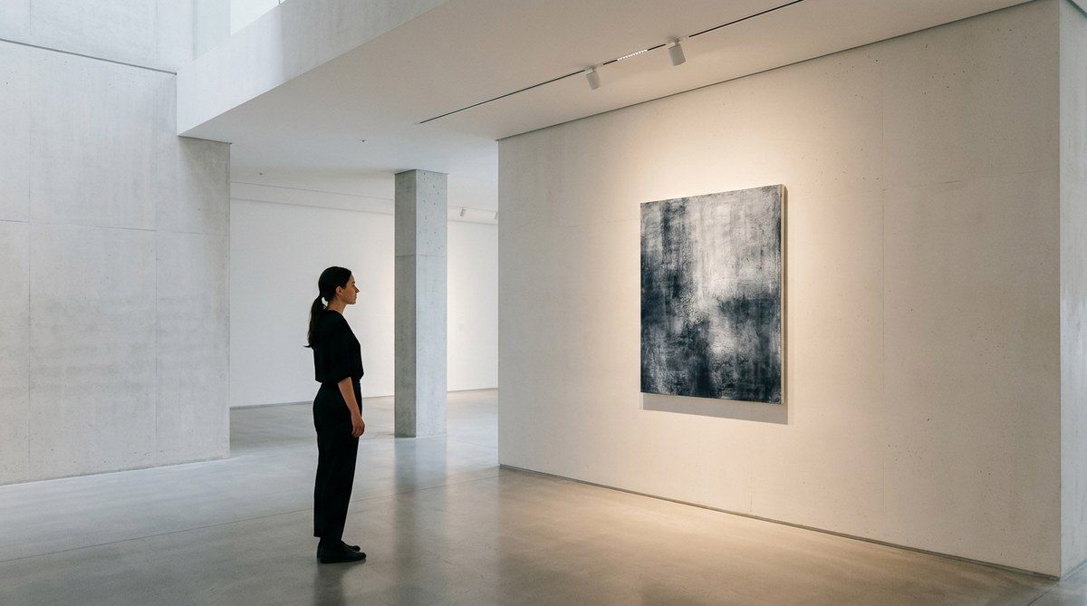
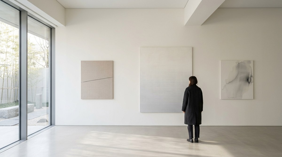
Think about the last time you walked into a gallery and saw a massive canvas covered in one color. Your eyes did not wander. They stayed. That is the core idea. When you remove the distraction of many competing colors, the viewer has nowhere else to look. The conversation becomes about the surface, the brushwork, and the light hitting the paint.
A monochromatic palette in minimalist art forces both the maker and the viewer to slow down. For art students, this is a valuable lesson in restraint. For interior designers, it is a strategy for creating spaces that feel grounded. A room with a single color story feels cohesive. It breathes. It allows the architecture and the objects within it to speak without shouting.
The Conceptual Weight of Color Restriction
Working with a monochromatic palette minimalist art style is a deliberate choice. It often carries conceptual weight. Artists like Yves Klein and his International Klein Blue did not just pick a color for decoration. He used it as a vehicle for the infinite. The blue became a window to something larger than the painting itself.
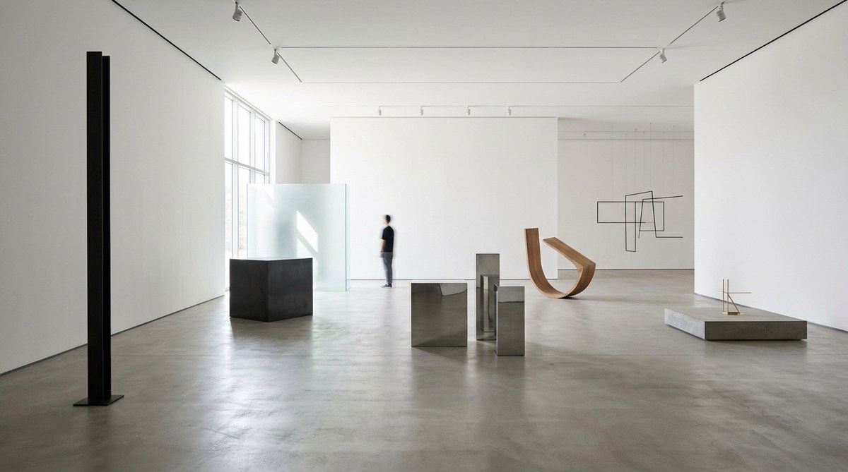
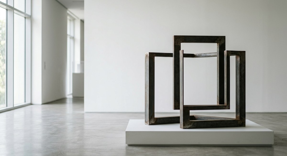
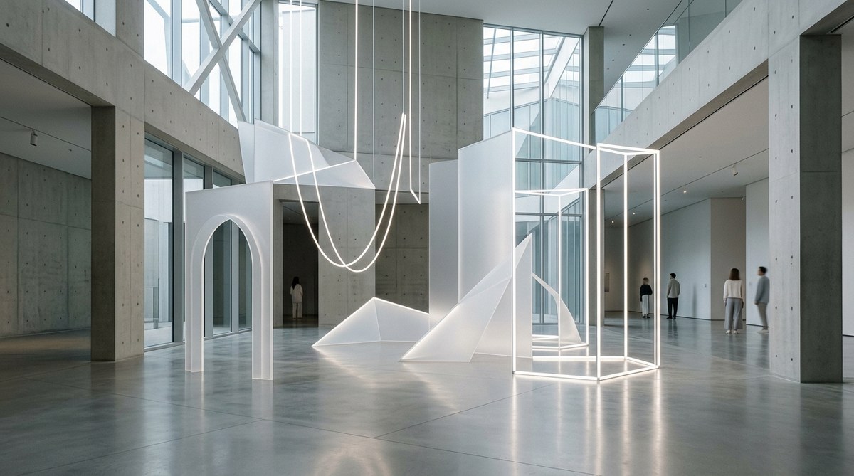
When you limit your palette, you are making a statement about what matters. You are saying that the subject, the texture, or the spatial relationship is more important than the spectacle of color. This idea resonates deeply with minimalist philosophy. It is about removing the unnecessary to reveal the essential. If you are curious about how this principle extends to physical objects, the discussion on the impact of object simplicity on modern art installations offers a great companion read.
How to Build a Monochromatic Palette
Creating a successful monochrome work is not as simple as picking one color and calling it done. You need variation in value, temperature, and saturation. Here is a practical process to get started.
- Choose your base hue. Pick a color that connects with the emotion you want to evoke. Cool blues for calm. Warm ochres for comfort. Deep charcoal for drama.
- Create a value scale. Mix your base color with white to create tints. Mix it with black to create shades. You need a range from very light to very dark.
- Introduce a temperature shift. If your base is a cool blue, add a tiny amount of warm brown or violet. This keeps the eye engaged without breaking the monochromatic rule.
- Test on your surface. The same color will look different on a glossy canvas than on matte paper or a rough wall. Always test your full range before you commit.
- Step back often. Work in layers. Let each layer dry. A monochrome piece reveals its depth slowly. Patience is your best tool.
Common Techniques and Mistakes
Understanding what works and what does not can save you time and frustration. The table below outlines effective techniques versus common missteps when working with a monochromatic palette minimalist art approach.
| Technique | Why It Works | Common Mistake | Why It Fails |
|---|---|---|---|
| Using varied textures | Creates visual interest without new colors | Relying on flat application | The piece looks like a single swatch of paint |
| Playing with light and shadow | Adds depth and dimension | Ignoring the light source | The work feels flat and lifeless |
| Mixing subtle undertones | Prevents the color from feeling dead | Using pure color straight from the tube | The result is harsh and one-dimensional |
| Leaving areas of negative space | Gives the eye a place to rest | Filling every inch of the surface | The work feels claustrophobic |
| Working in layers | Builds complexity over time | Trying to finish in one coat | The color lacks richness and history |
What the Experts Say
“Monochrome painting is not about the absence of color. It is about the presence of everything else. When you take away the rainbow, you are left with the truth of the material, the hand of the artist, and the quality of the light.” – A practicing minimalist painter on the value of restriction.
This advice is a reminder that a monochromatic palette is a tool for honesty in art. It strips away pretense. For interior designers, this translates into spaces that feel authentic. A room with a single color family, varied through texture and material, feels more intentional than a room with a dozen accent colors.
Applying Monochrome to Your Space
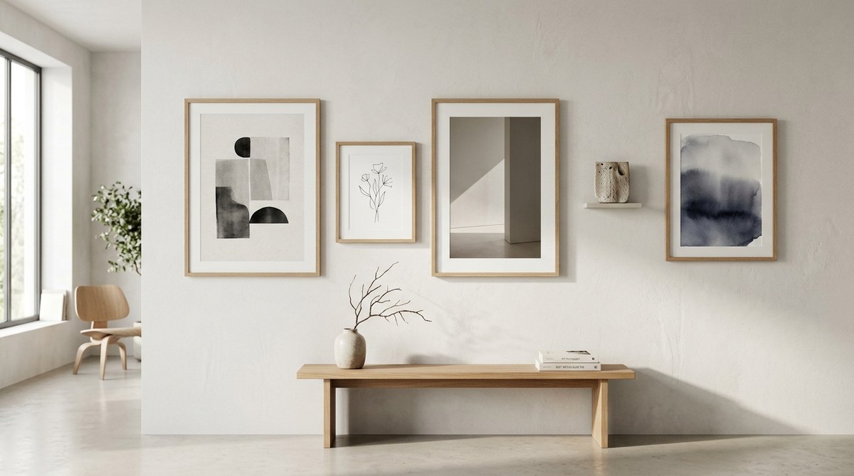
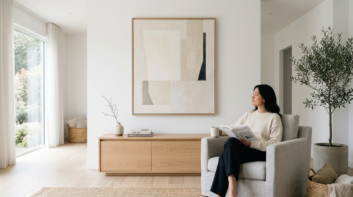
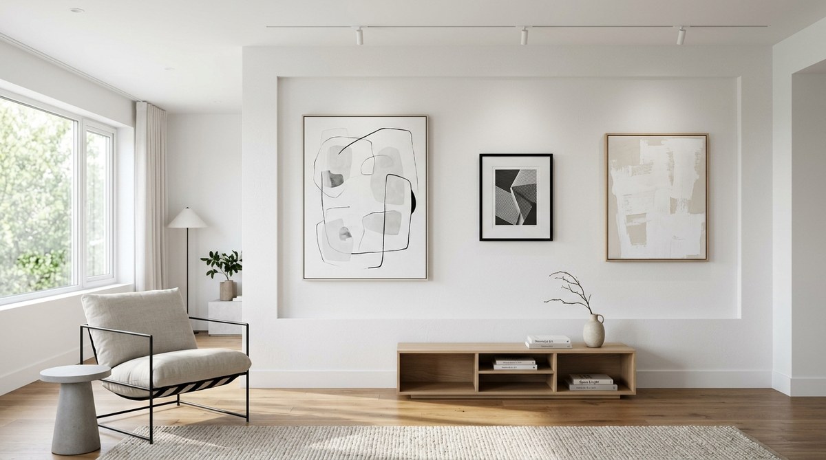
You do not have to be a painter to use these ideas. Interior designers can take the principles of a monochromatic palette minimalist art and apply them to any room. Start with one wall. Paint it a deep, warm gray. Then choose furniture that lives in the same tonal family. A light gray sofa. A charcoal rug. A few pillows in a slightly lighter shade of the same gray.
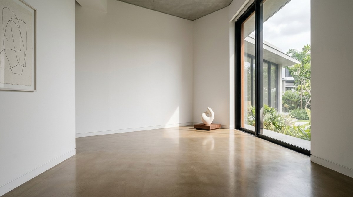
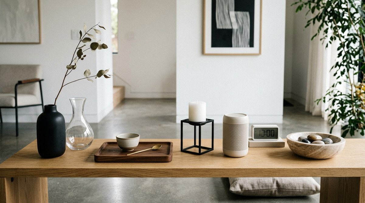
The magic happens when you add texture. A chunky knit throw. A smooth ceramic vase. A rough linen curtain. These elements provide the visual variety that color usually supplies. The room becomes a study in subtlety. For more on how this idea connects to spatial design, consider the insights in creating harmonious art spaces with minimalist design principles.
A Checklist for Your Next Project
Before you start your next piece or room, run through this list.
- Does my chosen hue support the mood I want?
- Do I have enough range between my lightest and darkest value?
- Have I considered the surface texture?
- Is my lighting going to help or hurt the color?
- Am I allowing for enough negative space?
Answering yes to these questions puts you on solid ground.
The Long Game of Limited Color
Working with a monochromatic palette is a discipline. It teaches you to see nuance. It trains your eye to notice the difference between a warm white and a cool white. It makes you a better observer of light. Over time, you will find that you can say more with less. This is the heart of minimalist art. It is not about being boring. It is about being precise.
For art students, this practice builds a foundation that will serve any style you explore later. For designers, it creates spaces that clients find peaceful and memorable. For enthusiasts, it offers a way to engage with art that feels personal and meditative.
Letting the Quiet Lead
The next time you stand in front of a painting that uses only one color, resist the urge to call it simple. Look closer. Notice how the artist handled the edges. See how the light changes across the surface. Feel the space around the work. That is the quiet power of a monochromatic palette in minimalist art. It does not shout. It waits. And when you are ready to listen, it has a lot to say.
Start your own study today. Pick one color. Find three different materials in that color. Arrange them in a small still life or a corner of a room. Sit with it for a week. See how your perception changes. That is where the real learning begins.

Leave a Reply