
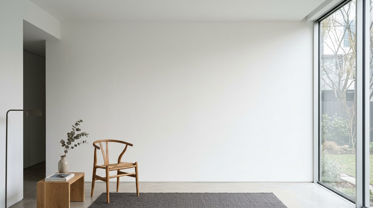
That big blank wall in your living room has been staring back at you for months. You know you want to do something with it, but you also know that filling it with random frames, shelves, and knickknacks will only create visual noise. The good news is that you don’t need a lot of stuff to make a statement. In fact, the most compelling empty wall design ideas rely on restraint, intention, and a deep respect for negative space. A single well-chosen element can transform a flat surface into a focal point that anchors the entire room.
You do not need to cover every inch of a blank wall to make it look complete. The best wall decor strategies prioritize one strong focal point, respect the surrounding negative space, and use texture or scale over clutter. Whether you choose a single oversized artwork, a sculptural object, or a play of light and shadow, the goal is to create a deliberate pause in the room. This approach turns an empty wall into a calm, confident design choice.
Why Your Wall Feels Unfinished
Before you start shopping for decor, it helps to understand why that wall feels so awkward. A large empty surface lacks visual weight. It feels unfinished because your eye expects something to balance the furniture and activity happening in the rest of the room. The fix is not to add more things. The fix is to add the right thing.
Think of your wall as a canvas for negative space. In minimalist design, the emptiness around an object is just as important as the object itself. A single piece of art hung with plenty of breathing room feels intentional. A cluster of small frames crammed together feels anxious. The difference is planning.
The Core Principle: One Strong Focal Point
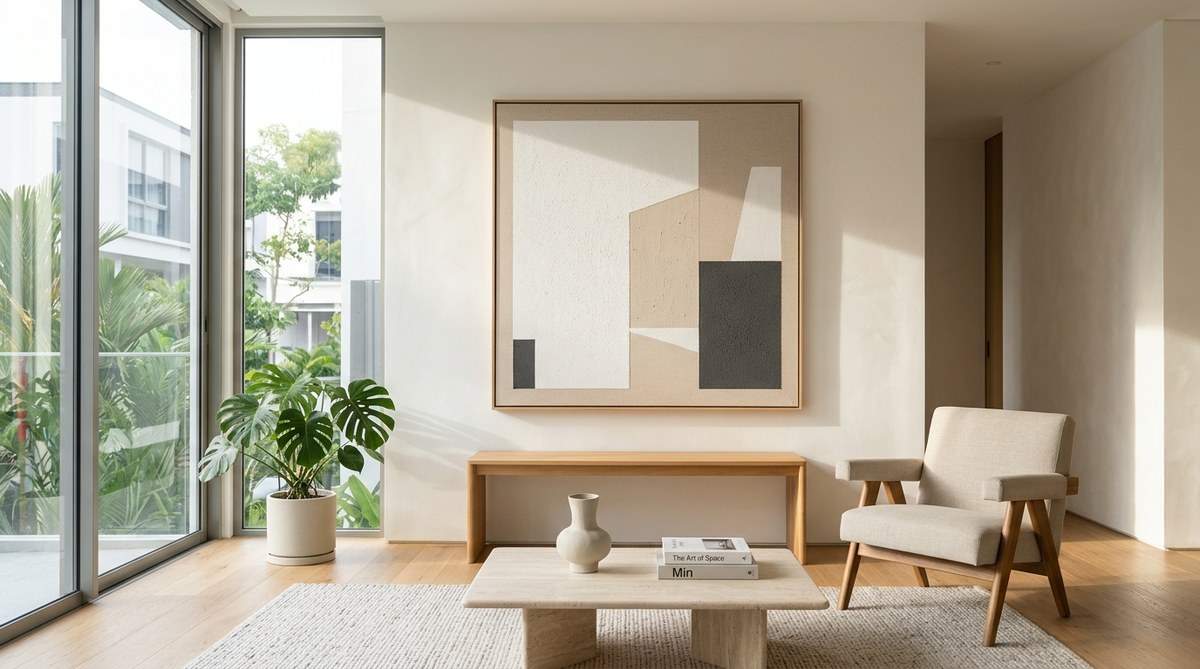
The most effective way to handle a large blank wall is to choose one element and let it own the space. This could be a large-scale painting, a sculptural mirror, or even a single piece of furniture like a low console table. The key is to resist the urge to add supporting pieces around it.
Here is a simple process to find your focal point:
- Measure your wall. Note the width and height. Stand back and take a photo. This helps you see the space objectively.
- Identify the room’s existing lines. Look at the sightlines from your sofa, dining table, or entryway. Where does your eye naturally land? That is where your focal point should go.
- Choose a single element that is at least one-third the width of the wall. Scale is everything. A piece that is too small will look lost. A piece that is too large will feel oppressive.
- Hang or place it at eye level. For most people, that means the center of the piece should be 57 to 60 inches from the floor.
- Walk away for 24 hours. Live with the empty wall and the new piece. Do not add anything else until you feel sure the space is complete.
15 Empty Wall Design Ideas That Honor Minimalism
These ideas are built for homeowners and renters who want a curated look without the clutter. Each one respects the principle of negative space while adding personality and depth.
1. One Oversized Artwork
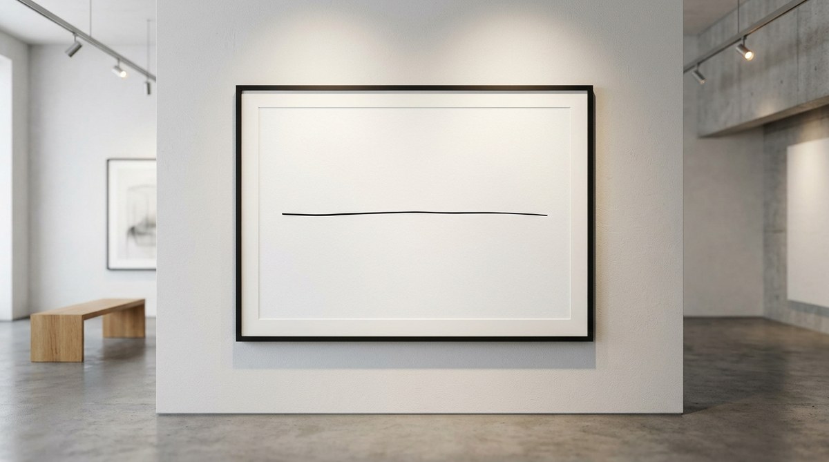
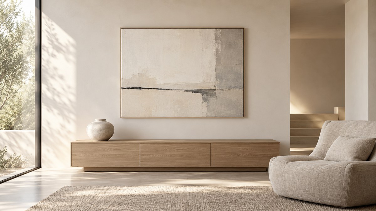
A single large canvas or framed print does more work than a gallery wall of ten small pieces. The scale creates drama. The empty space around it creates calm. Look for abstract pieces, monochromatic palettes, or landscapes with plenty of sky. The goal is to let the art breathe.
2. A Statement Mirror
Mirrors are a minimalist’s best friend. They reflect light, make a room feel larger, and add a sculptural element without adding visual weight. Choose a round or organic shape to soften the hard lines of a wall. Lean it against the wall on a console table for a casual look, or hang it securely with a wire.
3. A Single Sculptural Object
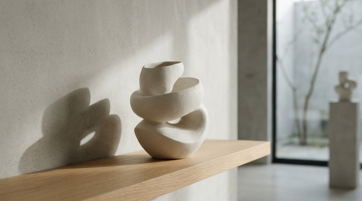
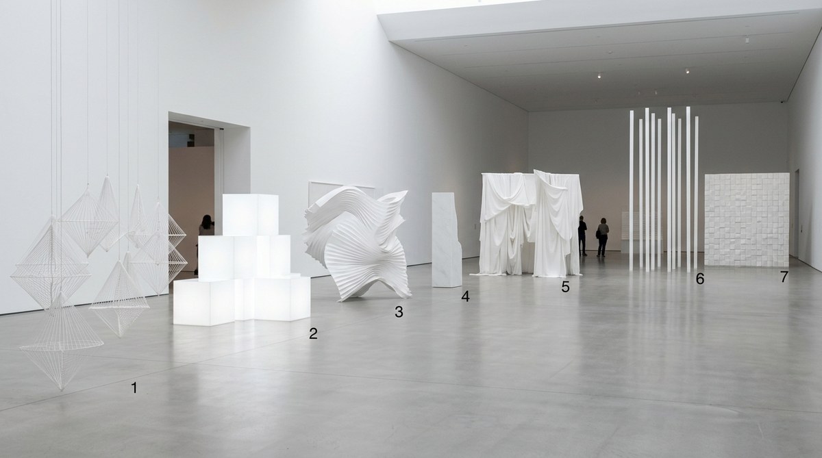
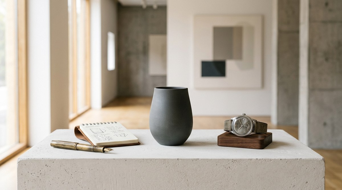
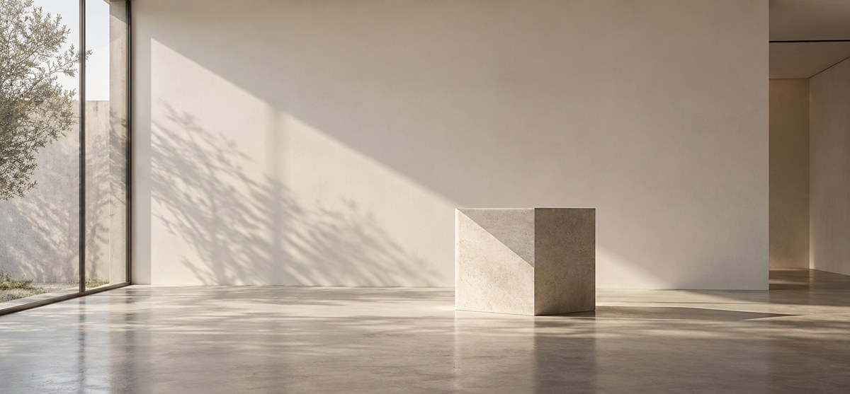
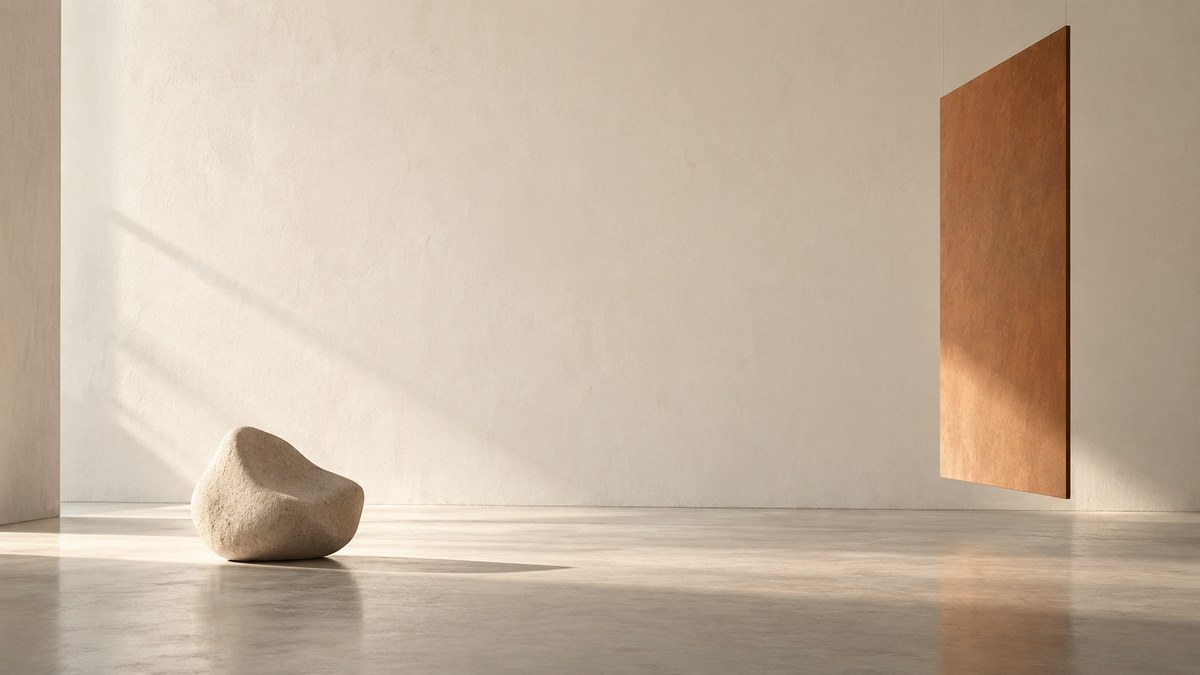
Sometimes the most powerful statement is not a painting but a three-dimensional object. A large ceramic vessel, a carved wood bust, or a minimalist sculpture can sit on a pedestal or a low shelf. The shadow it casts becomes part of the design.
4. A Vertical Plant Installation
Living walls are popular, but they can feel busy. For a minimalist approach, use a single tall plant in a simple pot, or mount a single air plant in a geometric frame. The organic shape contrasts beautifully with the flat wall.
5. A Monochromatic Tapestry or Textile
Textiles add warmth and texture without the formality of a frame. A large linen or cotton weave in a neutral tone can soften a room and absorb sound. Choose a piece with subtle texture rather than a busy pattern.
6. A Single Floating Shelf with One Object
Floating shelves are often used to display collections, but that can lead to clutter. Instead, install one long shelf and place a single object on it. A stack of art books, a single vase, or a small sculpture. The empty space on the shelf is part of the design.
7. A Light Sculpture or Pendant
Why not make the light fixture the art? A sculptural pendant light that hangs close to the wall, or a wall-mounted sconce with an interesting shape, can act as a focal point. The light it casts creates a second layer of design through shadow.
8. A Grid of Identical Small Pieces
This is the one exception to the “single focal point” rule. A grid of identical small pieces, such as four or six square frames with the same matting, creates a unified block of visual weight. The repetition feels orderly and intentional, not cluttered.
9. A Large Architectural Fragment
Old moldings, carved corbels, or a vintage window frame can be hung as a standalone piece of art. The patina and history add character. The irregular shape breaks up the wall without needing multiple elements.
10. A Single Piece of Furniture
A low credenza, a bench, or a long console table can anchor a wall all by itself. Style it with one lamp or one vase. The furniture becomes the art. This works especially well in entryways and behind sofas.
11. A Wall of Light and Shadow
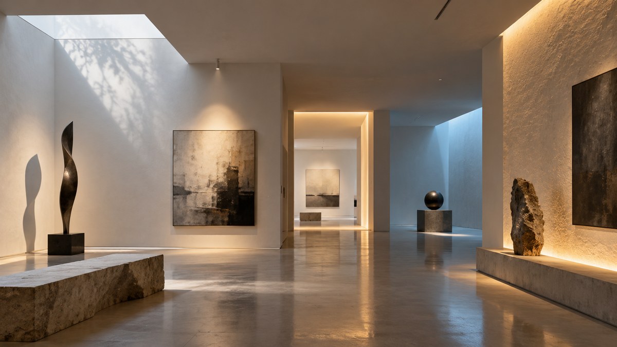
Use a directional spotlight or a picture light to create a pool of light on the wall. The light itself becomes the design element. The shadow it casts changes throughout the day, giving the wall a living quality. This technique pairs beautifully with a completely empty wall.
12. A Single Framed Photograph
Scale matters here. A very large black-and-white photograph, printed on matte paper and framed with a wide white mat, can hold a wall on its own. The lack of color keeps the look minimal. The subject matter should be simple, like a single leaf, a horizon line, or a portrait.
13. A Macrame or Knotted Wall Hanging
For a softer, more bohemian take on minimalism, a single macrame piece in natural cotton or jute adds texture without color. Keep the design simple. Avoid fringe-heavy pieces that feel busy. A clean, geometric knot pattern works best.
14. A Wall-Mounted Sculpture or Relief
Metal or wood wall sculptures add dimension. Look for pieces that are flat enough to hang flush but have enough depth to cast a shadow. Abstract shapes in black, white, or raw wood work well.
15. Nothing at All
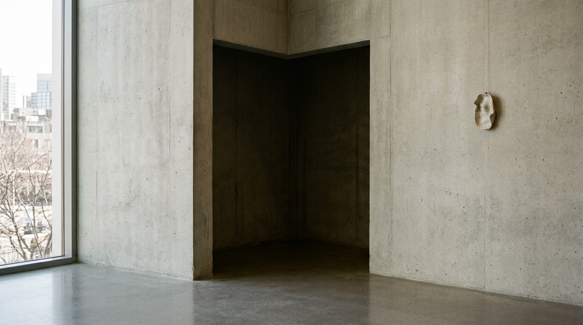
This is the most radical idea, and it is perfectly valid. Some walls are best left empty. If the room has strong architectural features, large windows, or a view, the wall may not need anything. Let the space breathe. Let the eye rest.
Techniques vs. Common Mistakes
This table breaks down what works and what does not when you are applying these empty wall design ideas.
| Technique | Why It Works | Common Mistake | Why It Fails |
|---|---|---|---|
| One large artwork | Creates a strong focal point; respects negative space | Hanging a piece that is too small | The art looks lost and the wall still feels empty |
| A single mirror | Reflects light; expands the room visually | Using a mirror with a heavy, ornate frame | Adds visual clutter and fights the minimalist intent |
| A sculptural object | Adds depth and shadow; feels curated | Placing the object on a cluttered surface | The object competes with other items and loses impact |
| A grid of identical frames | Provides order and repetition | Mixing frame sizes and colors | Creates visual chaos instead of a unified block |
| Leaving the wall empty | Honors the architecture; reduces visual noise | Adding something just to fill the space | Results in a wall that feels unfinished and anxious |
“The goal of a minimalist wall is not to be empty. It is to be deliberate. Every object you add should feel like a choice, not a default.”
* Design principle adapted from the teachings of spatial minimalism
How to Decide Which Idea Is Right for Your Room
Not every idea works in every space. Here is a bulleted list to help you narrow down your options based on your room’s needs.
- If your room feels small: Choose a mirror or a light sculpture. Both tricks the eye into seeing more space.
- If your room feels cold: Add a textile or a plant. They bring warmth and organic softness.
- If your room feels cluttered: Leave the wall empty or use a single sculptural object. Less is more.
- If your room feels flat: Use an oversized artwork or a wall-mounted sculpture. The scale adds drama.
- If your room has low ceilings: Hang a vertical piece or a tall plant. It draws the eye upward.
- If your room has high ceilings: Use a low console table with one object on it. It grounds the space.
The Role of Light in Empty Wall Design
Light is often the forgotten element in wall decor. A wall that looks flat during the day can come alive at night with the right lighting. Consider a picture light above a single artwork, or a floor lamp that washes the wall with light. The interplay of light and shadow adds a dynamic quality that no physical object can match. For more on this, read about the art of light and space in minimalist interior design.
Embracing the Power of Negative Space
Negative space is not wasted space. It is active space. It gives your eye a place to rest. It makes the objects you do choose feel more important. When you hang one piece of art on a large wall, the empty space around it is not a failure. It is a design choice. It tells the viewer that you are confident enough to leave things out.
This principle applies beyond just walls. The same thinking can be applied to your entire home. If you want to understand how this philosophy reshapes interiors, take a look at how minimalist art can unclutter your mind and home in 2026.
A Simple Checklist Before You Hang Anything
Before you commit to a piece, run through this checklist.
- Does this piece take up at least one-third of the wall’s width?
- Does it have a simple, uncluttered silhouette?
- Does the color palette match the room without competing?
- Is there enough empty space around it to let it breathe?
- Does it feel intentional, or does it feel like filler?
- Would the wall look better with nothing on it?
If you answered no to any of the first five questions, or yes to the last one, step back and reconsider.
Making an Empty Wall Your Most Powerful Statement
A blank wall is not a problem to be solved. It is an opportunity to practice restraint. The most memorable rooms are not the ones with the most stuff. They are the ones where every object feels chosen, every surface has room to breathe, and the empty spaces feel just as intentional as the filled ones.
Start with one wall. Pick one idea from this list. Live with it for a week. You might find that the empty wall you were so worried about becomes your favorite part of the room. And once you feel that shift, you will never look at a blank wall the same way again.

Leave a Reply