A well designed art space does more than hold your favorite pieces. It changes how you see them. In 2026, more people are turning away from clutter and toward rooms that breathe. They want spaces where every object has a reason to be there. This shift is not about owning less for the sake of it. It is about making room for what matters. Whether you are setting up a home gallery, a studio corner, or a living room that doubles as an exhibition wall, the rules of minimalist art spaces can help you get there without the guesswork.
Minimalist art space principles rest on seven core ideas: purposeful reduction, negative space, intentional lighting, material honesty, restrained color, spatial rhythm, and object hierarchy. When applied together, these principles transform any room into a place where art can speak clearly. This guide explains each principle with practical steps, real examples, and common mistakes to avoid.
Why Minimalist Art Spaces Matter More Now
The way we live has changed. Homes in 2026 are smaller in many cities, and people work from them more often. A room stuffed with furniture and decor does not help you focus or relax. Minimalist art spaces offer an alternative. They give your eyes a rest and let the artwork take center stage. This is not about empty rooms. It is about deliberate choices. When you remove distractions, the things you keep gain power. A single large painting on a white wall can stop you in your tracks. The same painting surrounded by shelves, plants, and patterned wallpaper might go unnoticed.
Artists in the minimalist movement understood this decades ago. Donald Judd and Agnes Martin built their work around the idea that less clutter means more presence. That same logic applies to the rooms we build around art today. By following a set of clear principles, you can create a space that feels calm, curated, and completely yours.
The 7 Essential Principles of Minimalist Art Spaces
Each principle builds on the others. You do not have to follow them in order, but they work best as a set. Here is the foundation.
1. Reduction with Purpose
Reduction is the most misunderstood part of minimalism. It is not about taking everything away. It is about keeping only what serves a function or brings joy. In an art space, that means every wall, shelf, and surface should exist to support the artwork.
Start by removing anything that competes with the art. That includes busy window treatments, loud furniture, and decorative knickknacks. Ask yourself: does this object help me see the art better, or does it pull my attention away? If the answer is the second one, it should go.
A good test is to place one piece of art on a wall and live with it for a week. Add nothing else. Notice how your eye moves around the room. You might find that you do not need anything else on that wall at all.
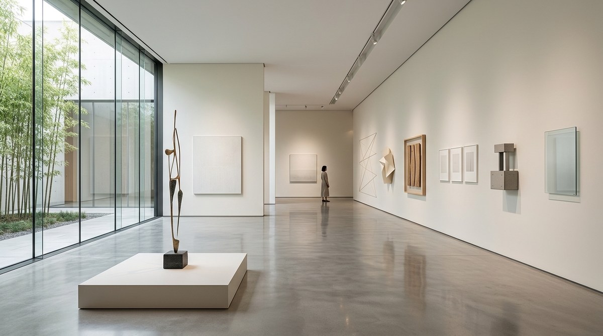
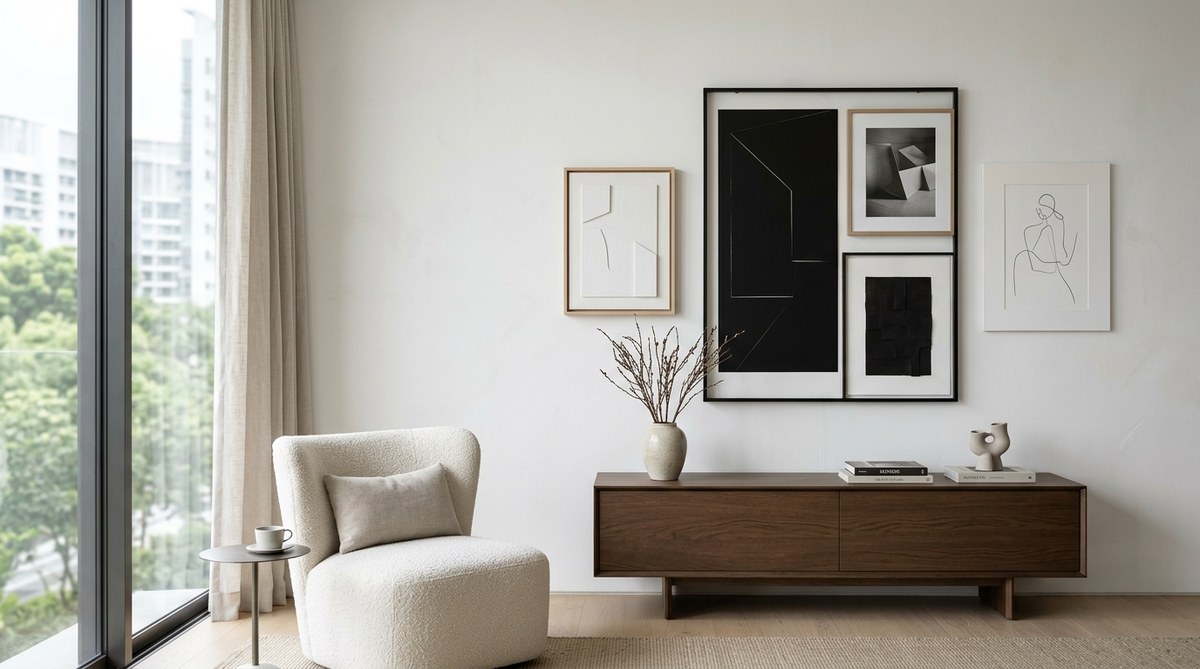
2. Negative Space as a Design Tool
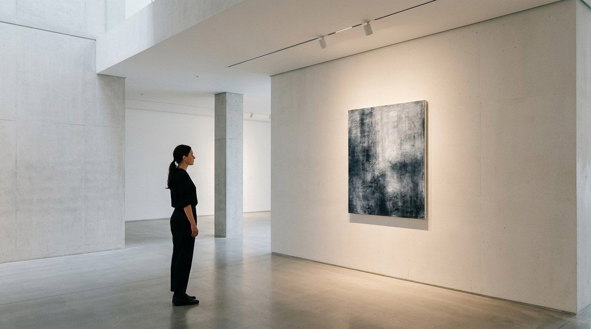
Negative space is the empty area around and between objects. In minimalist art spaces, it is not wasted space. It is active. It gives the eye a place to rest between pieces. It also creates a sense of scale and importance around each artwork.
When you hang a piece, leave generous space around it. Aim for at least six to twelve inches of bare wall on each side for smaller pieces, and even more for larger works. This buffer zone tells the viewer that what they are looking at matters.
You can learn more about this concept in our guide on
3. Lighting That Serves the Art
Light is the single most important tool in an art space. Natural light during the day is ideal, but it needs control. Direct sunlight can damage artwork over time. Use sheer curtains or UV filtering film to protect your pieces while keeping the room bright.
For artificial lighting, track lighting and adjustable picture lights give you control over direction and intensity. Avoid overhead fixtures that cast uneven shadows. Instead, aim light at a 30 degree angle toward the artwork. This reduces glare and brings out texture and color.
Warm white bulbs (around 3000 Kelvin) work well for most spaces. They keep colors accurate without feeling clinical.
Our article on https://minimalism.sg/the-art-of-light-and-space-in-minimalist-interior-design/ covers this topic in more detail.
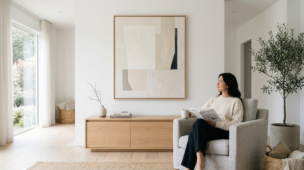
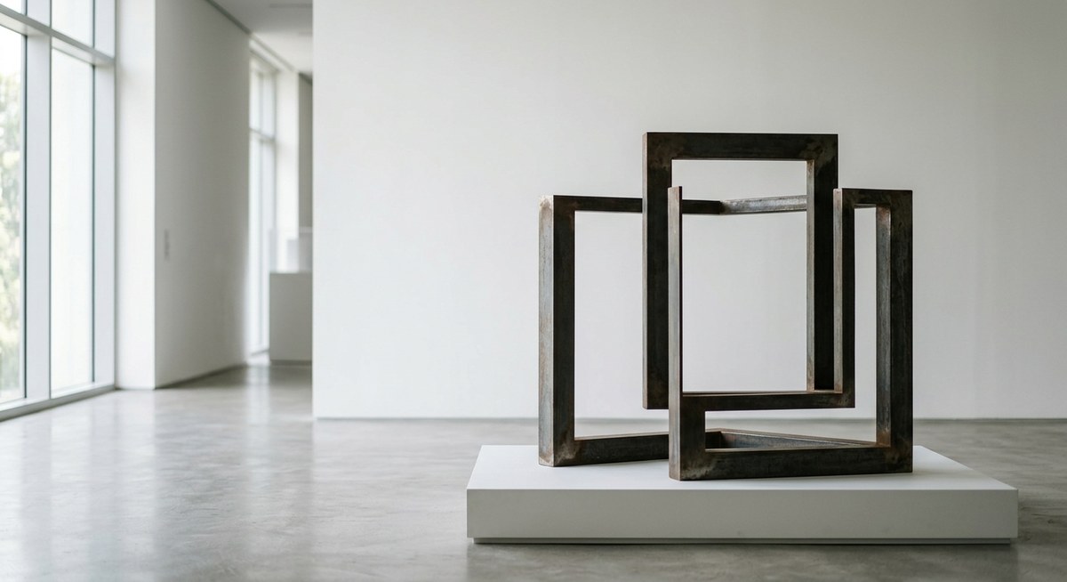
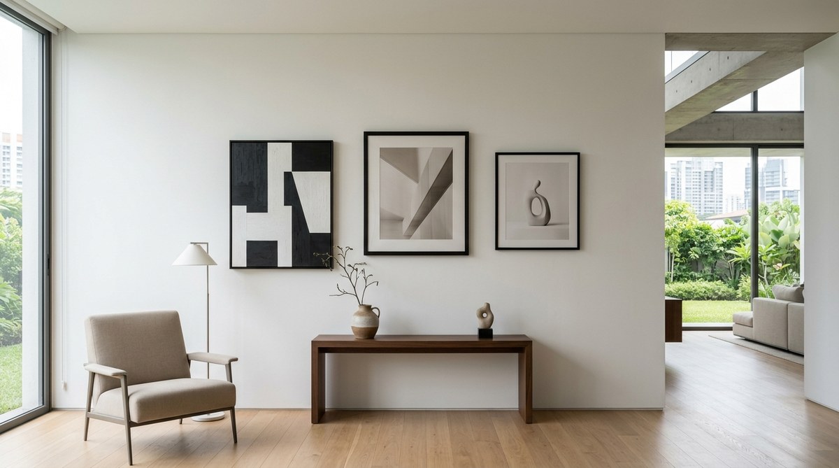
4. Material Honesty
Minimalist spaces do not hide what things are made of. A concrete floor stays concrete. A wooden shelf shows its grain. This honesty creates a calm, grounded feeling. It also removes the need for extra decoration.
Choose materials that feel natural and solid. Steel, stone, raw wood, linen, and glass all work well. Avoid plastic veneers, glossy finishes, and fake textures. When the materials are real, the space feels more authentic. The art inside it does too.
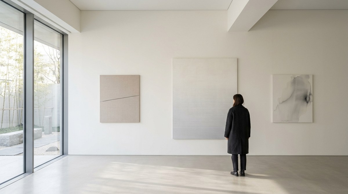
5. Restrained Color Palette
Color in a minimalist art space should support the art, not fight it. Neutral walls are the safest choice. White, off white, warm gray, and light beige give you a blank canvas. They also reflect light well, which helps the artwork stand out.
If you want a colored wall, choose one that echoes a tone in the artwork itself. For example, a deep ochre wall can make a painting with warm earth tones feel more cohesive. But limit this to one accent wall. Too many colors break the calm that minimalism is built on.
Floors and ceilings should stay neutral too. Light hardwood or polished concrete floors are popular choices in 2026. They keep the room grounded without stealing attention.
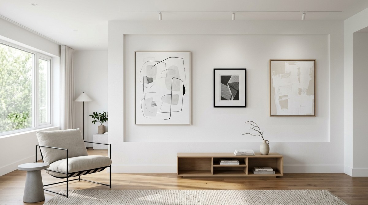
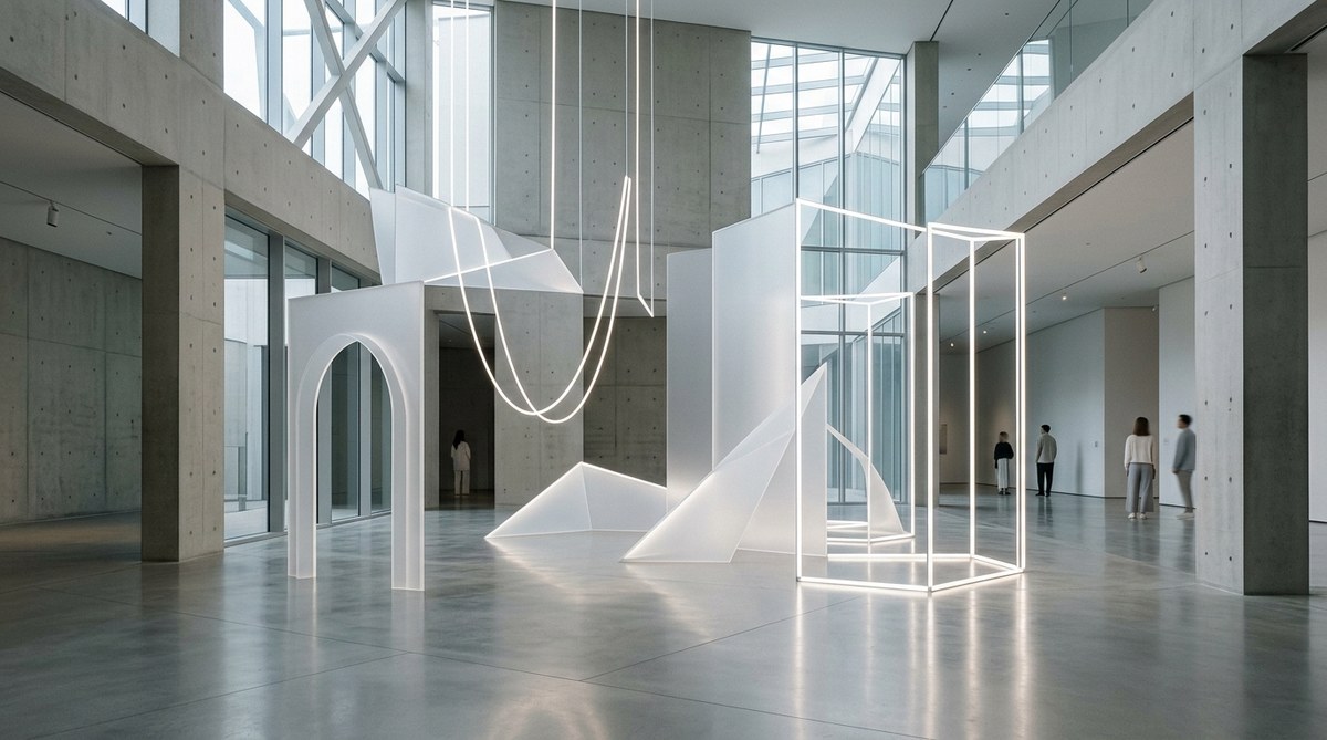
6. Spatial Rhythm and Flow
A room should guide the eye in a natural way. This is where spatial rhythm comes in. Arrange your art so that the viewer moves through the space without effort.
Place larger pieces at eye level where they act as anchors. Smaller works can go in groupings, but keep them spaced evenly. A common mistake is to spread art too thin across a wall. That makes the room feel scattered. Instead, group pieces closer together in one area and leave other walls bare. This creates a focal point and gives the room a sense of order.
Think of the room as a gallery. A gallery does not put one painting on every wall. It creates moments. You can do the same at home.
7. Object Hierarchy
Not every piece in your collection deserves the same treatment. Some are statement works. Others are supporting pieces. Decide which ones are which before you start hanging.
Your strongest piece should get the most space and the best lighting. Place it on a wall where it is the first thing people see when they walk into the room. Secondary works can go on side walls or in hallways. This hierarchy prevents the room from feeling chaotic. It also helps visitors understand what you value most in your collection.
If you are just starting to build a collection, take a look at https://minimalism.sg/the-art-of-simplicity-in-object-design-for-modern-spaces/ for guidance on choosing pieces that fit a minimalist aesthetic.
A Step by Step Process for Setting Up Your Space
Here is a numbered process you can follow to apply these principles in your own home.
- Clear the room completely. Remove all furniture, decor, and artwork. Start with a blank slate. Paint the walls a neutral color if needed.
- Choose one statement artwork. This piece will anchor the room. Place it on the most visible wall. Light it carefully.
- Add only essential furniture. A bench, a console table, or one chair. Nothing more. The furniture should be simple and made of natural materials.
- Bring in secondary art pieces. Place them on adjacent walls or in less prominent spots. Keep at least eight inches of space around each piece.
- Adjust the lighting. Install picture lights or track lighting. Test the angles at different times of day. Make sure there is no glare on the art.
- Live in the space for two weeks. Do not add anything new during this time. Notice how you feel in the room. If something feels off, move it.
- Edit again. After two weeks, remove anything that does not feel necessary. This final edit is what makes the space feel truly minimalist.
Common Techniques and Mistakes
The table below shows what works and what does not when applying minimalist art space principles.
| Technique | What It Does | Common Mistake |
|---|---|---|
| Using negative space | Gives art room to breathe | Crowding too many pieces on one wall |
| Layered lighting | Adds depth and highlights texture | Using a single ceiling light as the only source |
| Neutral wall colors | Creates a calm backdrop | Painting walls a bright or dark color that overpowers the art |
| Grouping art in clusters | Creates visual interest in one area | Spreading art evenly across all walls |
| Choosing natural materials | Adds warmth without decoration | Mixing too many different textures in one room |
| Leaving floor space clear | Makes the room feel larger | Filling every corner with furniture or plants |
| Editing down to essentials | Keeps focus on the art | Keeping sentimental objects that do not fit the look |
A Note on Object Simplicity
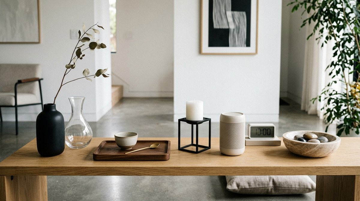
The objects you choose for the room matter as much as the art itself. A minimalist art space does not need much furniture. But the furniture you include should be simple and well made.
A low wooden console under a painting can ground the piece. A single ceramic vase on that console can add a human touch. But stop there. Do not add more. Each object should earn its place.
For more ideas on how object design affects the feel of a room, read our article on
Practical Advice from a Designer
I spoke with an interior designer based in Portland who specializes in gallery style homes. Here is what she had to share.
“Most people try to do too much. They think a room needs to be full to feel finished. But a minimalist art space is never finished in the traditional sense. It is always slightly empty. That emptiness is what makes the art feel alive. My best advice is to hang one piece, then stop. Wait a month. See how it feels. Then decide if you need another. More often than not, you do not.”
How to Avoid the Most Common Pitfalls
Even with the best intentions, it is easy to slip into habits that work against a minimalist art space. Here are the most common mistakes and how to avoid them.
- Mistake: Hanging art too high. Art should be at eye level. The center of the piece should sit about 57 to 60 inches from the floor.
- Mistake: Using too many frames. Mismatched frames create visual noise. Stick to simple black, white, or natural wood frames. Or go frameless for a cleaner look.
- Mistake: Ignoring the floor. A cluttered floor ruins an otherwise clean space. Keep the floor clear except for one or two essential pieces of furniture.
- Mistake: Overloading one wall. It is better to have one strong focal wall than to spread art all over the room.
- Mistake: Forgetting about sound. Hard surfaces can make a room feel echoey. A single wool rug or a fabric sofa can soften the acoustics without adding clutter.
Bringing Balance to Your Art Space
Spatial harmony is the final layer. It is the feeling you get when everything in the room is in the right place. You cannot force it. It comes from following the principles and then stepping back.
Pay attention to how you feel when you walk into the room. Do you feel calm? Do you notice the art first? If the answer to both is yes, you have succeeded.
If the room still feels off, look for sources of visual weight. A dark piece of furniture on one side of the room might need to be balanced by a larger artwork on the opposite wall. Or a bright window might need a sheer curtain to soften the light. Small adjustments make a big difference.
For a deeper look at how spatial harmony works, check out our piece on
Making the Principles Work for You
The seven principles in this article are not rigid rules. They are starting points. Your home is not a museum. It should feel like you. But if you start with reduction, negative space, good lighting, honest materials, restrained color, spatial rhythm, and object hierarchy, you will have a strong foundation. From there, you can adjust based on your taste and your collection.
A minimalist art space does not have to be cold or sterile. It can be warm, inviting, and deeply personal. The key is to remove enough so that what remains has room to speak. When you get it right, the art does the work. The room just steps out of the way.
Your Next Step
If this is your first time setting up a minimalist art space, start small. Pick one wall. Clear everything off it. Hang your favorite piece. Light it well. Leave the rest of the wall empty. Live with that for a few weeks. You might find that one well placed piece is all you need. If not, add one more. Let the process be slow. That is the whole point.
When you are ready to go further, our guide on https://minimalism.sg/creating-harmonious-art-spaces-with-minimalist-design-principles/ can help you take the next step. It covers how to scale these principles across an entire home.
Leave a Reply