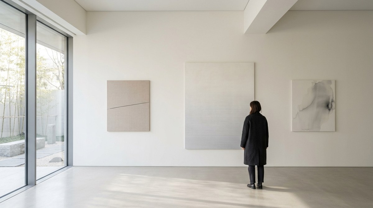
You step into a white room. One sculpture sits near the center. A single beam of light grazes its surface. The silence is so complete you can hear your own breathing. You walk around the object. It reveals different shadows, different textures. Ten minutes later, you realize you haven’t thought about your phone, your schedule, or anything else. This is the power of a well-executed minimalist art exhibition. It doesn’t shout. It whispers. And that whisper stays with you long after you leave.
A memorable minimalist art exhibition hinges on four elements: intentional use of negative space, controlled lighting that sculpts form, honest materials that speak for themselves, and a spatial layout that invites the viewer to become part of the artwork. When these elements align, the exhibition becomes an experience rather than just a display.
Space as a Canvas: The Power of Negative Space
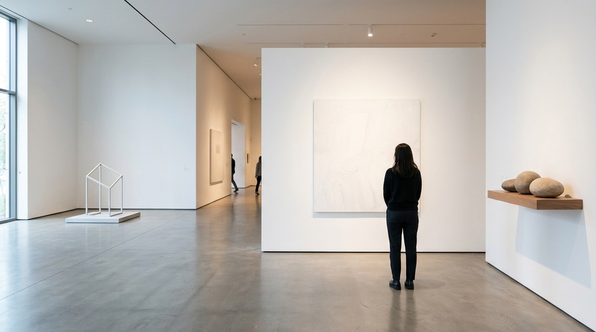
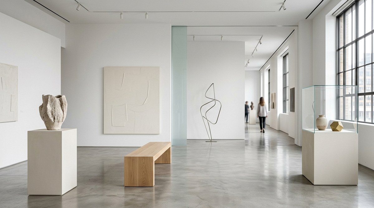
In minimalist art, the space around an object is just as important as the object itself. Negative space gives the artwork room to breathe. It lets the eye rest. A crowded gallery wall works against the minimalist ethos. Instead of layering pieces, curators should leave generous gaps between works. This creates a rhythm of looking and pausing.
Think of the gallery as a composition. Each piece is a note. The silence between notes is what creates the melody. In an exhibition, the empty walls and open floors are that silence. They allow visitors to focus on one work at a time. This focused attention is the first step toward a memorable encounter.
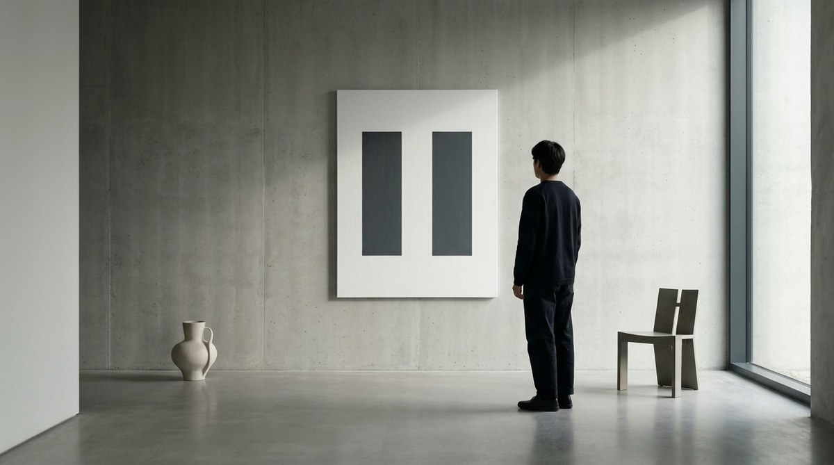
A common mistake is to treat white walls as a neutral backdrop that can be packed with art. But for minimalist pieces, the wall itself is an active participant. The proportion of the wall to the artwork dictates how the piece is perceived. Too much wall and the piece feels lost. Too little and it feels cramped. The ideal ratio varies, but a good rule of thumb is to leave at least four feet of space on either side of a medium-sized work. For larger installations, the room itself becomes the frame.
Light That Shapes and Defines
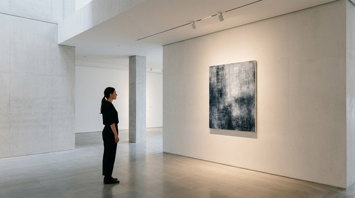
Lighting can make or break a minimalist exhibition. These works rely on surface, texture, and subtle variation. A single angle can turn a flat plane into a landscape of highlights and shadows. Curators should use directional lighting, not diffuse overhead floods. Track lighting with adjustable heads works well. It lets you pinpoint the light exactly where you want it. The goal is to sculpt the object with light.
Warm white bulbs (around 2700K to 3000K) often work best for neutral tones. They add a softness that prevents the space from feeling cold. However, for works that use stark monochromes, a cooler temperature (3500K to 4000K) can heighten the sense of precision. The key is to test the lighting before the opening. Walk around the piece at different times of day. Natural light can alter the mood. If the gallery has windows, you can use them to your advantage. A carefully placed piece can catch the afternoon sun and shift in appearance as the day progresses.
For more guidance on this topic, read our article on the art of light and space in minimalist interior design. It covers techniques that apply directly to exhibition spaces.
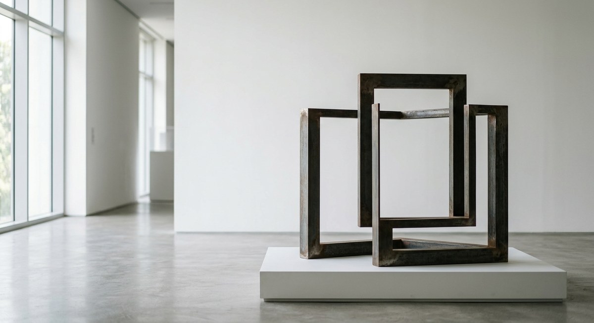
Material Authenticity: The Honesty of Objects
Minimalist art does not pretend to be something else. A steel beam is a steel beam. A canvas is a canvas. The material itself becomes the subject. This honesty creates a powerful connection between the object and the viewer. When you see a piece made of raw concrete or unfinished wood, you are invited to appreciate its texture, weight, and presence. There is no illusion, no story.
Curators should honor this authenticity by letting the materials stand on their own. Do not paint the pedestals. Do not add decorative framing. Let the object rest directly on the floor if possible. The less intervention, the more the material speaks. This principle extends to the gallery architecture. Exposed brick, polished concrete floors, and visible ductwork can complement the art. They reinforce the idea of truth to materials.
A memorable exhibition often includes works that invite touch. Of course, touching is not allowed for most pieces. But the visual texture should be so strong that you feel you could reach out and feel the grain. That sensory illusion is part of the magic.
The Viewer’s Presence: Interaction and Scale
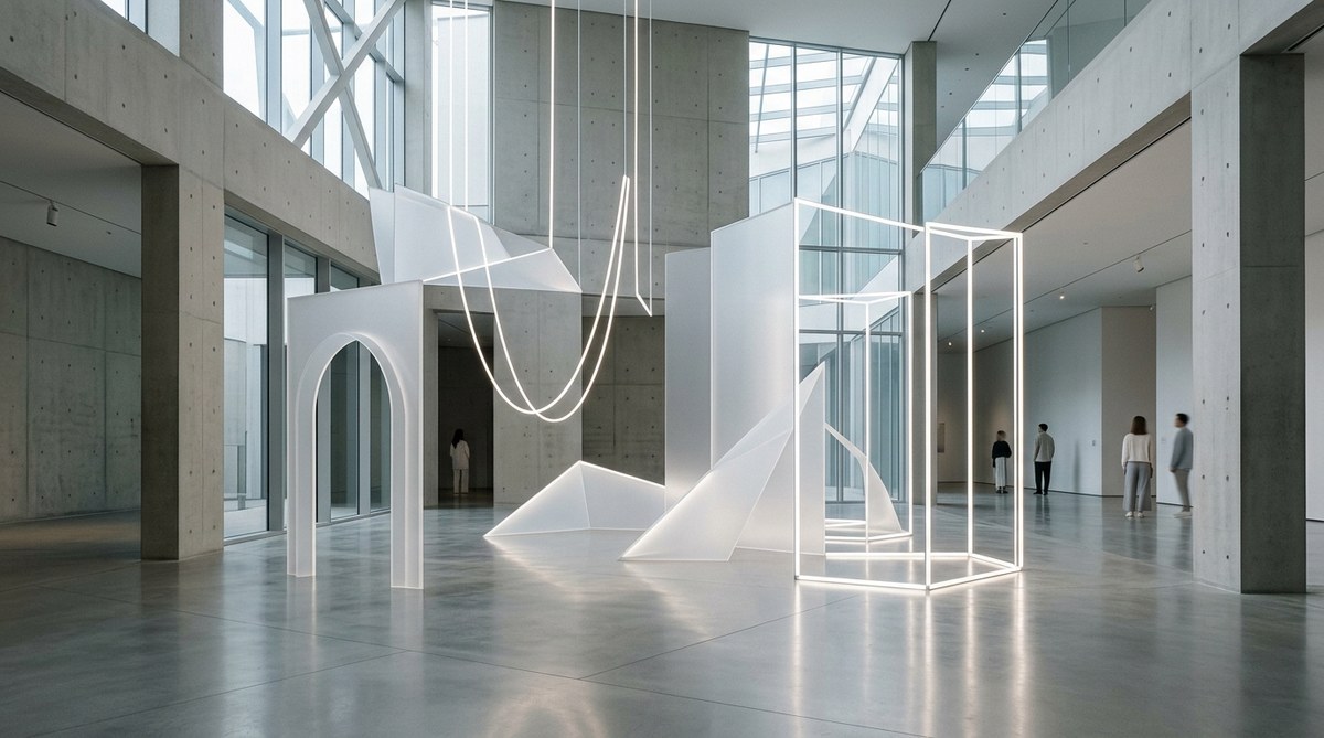
Minimalist art demands that the viewer complete the experience. The work does not explain itself. It exists. You must walk around it, approach it, step back. Your body becomes part of the spatial equation.
“Minimalist art demands that the viewer meet the work halfway. The exhibition must offer silence, not noise.”
— Mira Chen, independent curator
This is where scale matters. A small object on a large wall can feel precious. A massive structure that fills a room can feel overwhelming. Both can be effective. But the curator must decide what kind of response they want. For example, a Donald Judd-style stack of rectangular boxes at eye level invites a measured, analytical gaze. A Carl Andre floor piece made of metal tiles invites you to walk around its edge and consider your own footprint.
When planning an exhibition, think about the visitor’s journey through the space. Here are three practical steps to ensure strong viewer engagement:
- Map the sightlines. Stand at the entrance. What is the first thing you see? Make sure that focal point is strong. Then think about how the eye moves from that point to the next.
- Control the pacing. Place pieces so that visitors can pause naturally. Group works that relate to each other, but leave breathing room between groups.
- Consider height and orientation. Vary the hanging height slightly to create a visual rhythm. For floor works, ensure they are not hidden behind taller visitors. Raise the floor slightly with a platform if needed.
A bulleted list of characteristics that make an exhibition memorable:
- Intentional emptiness that feels curated, not empty
- Lighting that reveals rather than flattens
- Works that communicate through material and form alone
- A layout that guides the viewer without being prescriptive
- Sensory engagement through scale, texture, and space
Common Mistakes and How to Avoid Them
Even experienced curators can get the basics wrong. The table below outlines frequent errors and the effective alternatives that produce a memorable exhibition.
| Common Mistake | Effective Technique |
|---|---|
| Overcrowding the walls with too many small works | Use fewer pieces with generous spacing; let each work breathe |
| Harsh, uniform overhead lighting | Install adjustable track lights; use spotlights to highlight individual pieces |
| Ignoring the floor plan | Create a clear path; use sightlines to lead visitors through the space |
| Adding text labels that explain the work | Keep labels minimal; let the artwork speak first |
| Using standard white frames or pedestals | Choose raw materials or neutral surfaces that do not compete with the art |
| Placing works at eye level only | Vary heights to create visual interest; include floor pieces and ceiling-hung works |
By avoiding these pitfalls, you give the exhibition a professional, thoughtful feel. The viewer will notice the difference even if they cannot articulate why. The space will feel intentional.
For a deeper look at how minimalist principles apply to broader design, see our guide on discovering the power of negative space in minimalist art. It connects the dots between gallery curation and everyday spaces.
Making the Viewer the Anchor
In many ways, a minimalist exhibition is incomplete without an audience. The viewer’s movement activates the space. Their shadow falls on a wall. Their footsteps echo. This participation turns a static display into a living experience.
Think about how to use this to your advantage. Place a large work at the end of a hallway so that visitors approach it gradually. Create a narrow corridor where people must pass close to a series of small objects. Use mirrors to reflect the viewer back into the space. The most memorable shows are the ones where you remember both the art and your own reaction to it.
One curator I know always includes a single bench in each room. Not for comfort, but for contemplation. A bench invites people to sit still for a few minutes. In that stillness, the art works its magic. Without a place to rest, visitors tend to move through quickly. They see everything and remember nothing.
Crafting Your Own Memorable Minimalist Exhibition
Bringing these elements together takes practice. Start small. Pick one piece and build a room around it. Test the lighting at different times. Walk the space as a visitor would. Ask a friend to walk through and describe how they feel. Adjust accordingly.
The four elements of space, light, material, and viewer interaction are not a checklist. They are a system. When each one supports the others, the exhibition becomes more than the sum of its parts. It becomes a place where people want to stay. Where they forget the outside world. Where they come back to, days later, still thinking about that one object in the corner.
That is the mark of a truly memorable minimalist art exhibition. And with careful attention to detail, you can create that experience for your own visitors. Go ahead. Strip everything away. Leave only what matters. The rest will follow.
Leave a Reply