A gallery wall can transform a blank wall into something personal. But when you lean toward minimalism, the standard advice to fill every inch with art can feel wrong. You want a display that breathes. You want each piece to earn its place. The good news is that a minimalist gallery wall is not about having less art. It is about choosing with intention and letting the wall itself become part of the composition. Whether you rent a small apartment or own a home with plenty of wall space, this approach works. It gives you a curated look that feels calm, deliberate, and entirely yours.
A minimalist gallery wall is built on intention, not emptiness. Start by defining a mood and a limited color palette. Choose fewer pieces and give them room to breathe. Plan your layout on the floor before you pick up a hammer. Use consistent spacing and align edges for a clean look. Edit ruthlessly. The goal is a curated display that feels ordered, personal, and visually calm.
What Makes a Gallery Wall Minimalist
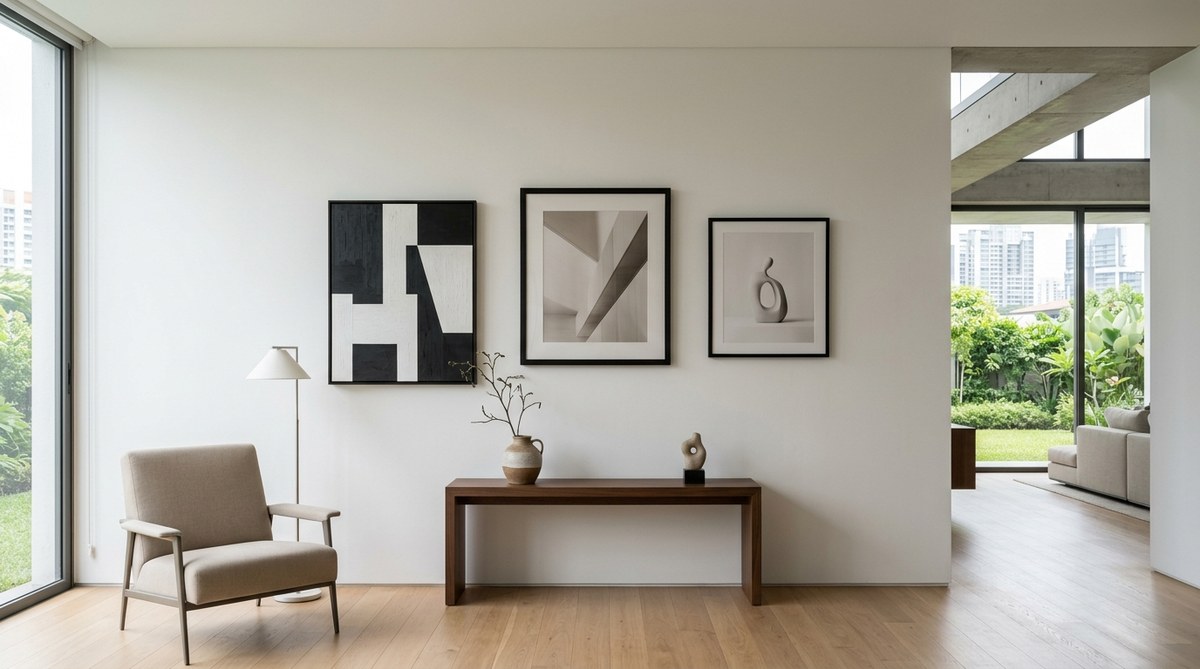
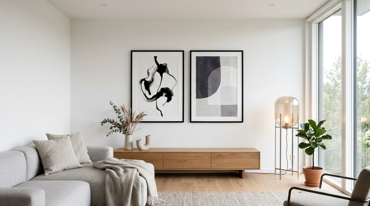
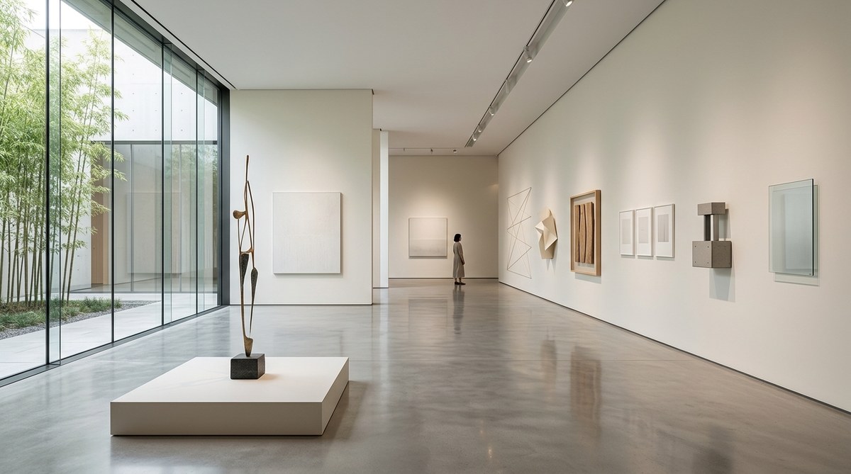
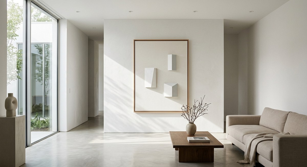
A minimalist gallery wall is not defined by how many pieces you hang. It is defined by the relationship between the art and the empty space around it. In a traditional gallery wall, you might see a dense cluster of frames covering a large area. In a minimalist version, each piece gets room to stand on its own. The negative space becomes a design element.
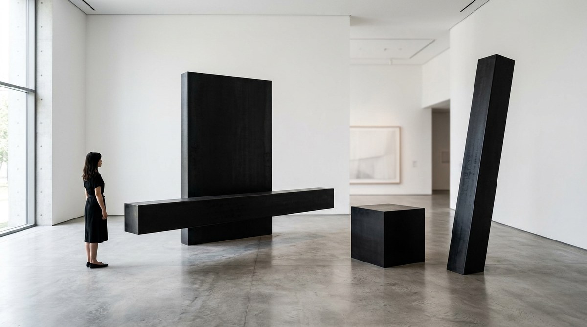
This approach borrows directly from minimalist art philosophy. The idea is that less visual noise creates more impact. When you reduce the number of elements, the ones that remain carry more weight. That single abstract print or black and white photograph becomes a focal point rather than part of a crowd.
If you want to understand how this principle applies to art spaces at a larger scale, you can read about the power of negative space in minimalist art and how it shapes the way we experience a room.
Why Less Really Is More
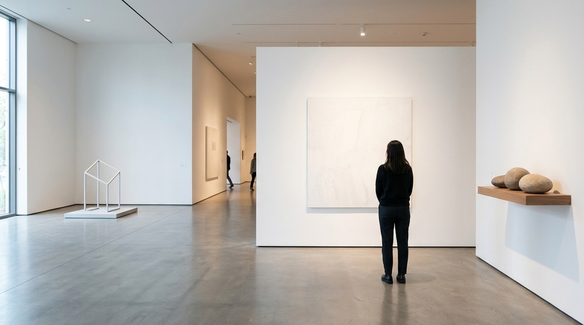
Minimalist design is not about deprivation. It is about clarity. When you walk into a room with a carefully edited gallery wall, your eye knows where to rest. There is no confusion. There is no visual shouting match between competing frames.
For renters especially, a minimalist gallery wall makes practical sense. You can achieve a high impact look with fewer pieces, which means less money spent on framing and fewer holes in the wall. When you move out, you take down five or six items instead of twenty. It is a simpler process from start to finish.
For homeowners, the benefit is longevity. A minimalist gallery wall does not date itself. It avoids trends like matchy matchy frame sets or overcrowded grids. What you hang today will still look good five years from now, as long as you stick to timeless pieces and a restrained palette.
How to Build Your Minimalist Gallery Wall in 6 Steps
Follow this process to create a display that feels deliberate and polished.
Step 1: Define Your Visual Mood
Before you pick any art, decide on the feeling you want the wall to create. Do you want a calm, spa like atmosphere? Go for soft tones, organic shapes, and matte frames. Do you want a modern, architectural look? Choose black and white photography, geometric prints, and thin black frames. Write down three words that describe the mood. Refer back to them when you choose each piece. If a print does not match that mood, leave it out.
Step 2: Choose a Limited Color Palette
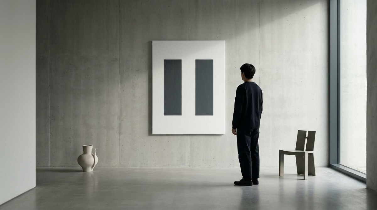
Color is the strongest tool for creating cohesion. In a minimalist gallery wall, you should limit yourself to two or three colors at most. The simplest route is to use only black, white, and one neutral tone like beige or gray. You can also work with a monochrome palette using different shades of the same color. If you prefer a subtle pop of color, pick one accent shade and use it sparingly across one or two pieces.
Step 3: Select Your Pieces with Intention
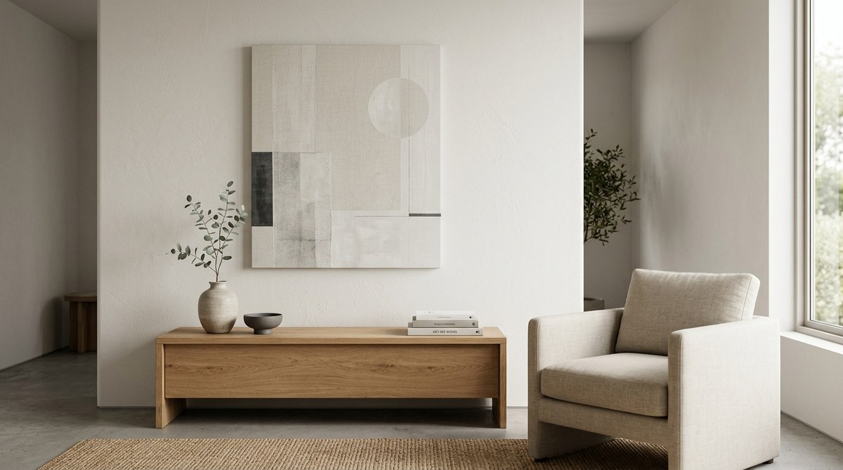
Quality matters more than quantity. Aim for three to seven pieces depending on your wall size. Look for art that shares a common thread. That could be a similar subject matter, a consistent texture, or a matching frame finish. Avoid buying pre packaged sets. They often look too uniform and lack personality. Instead, mix a large statement piece with a few smaller companion pieces. If you are unsure where to start, think about what you already own that feels meaningful. A personal photograph, a vintage map, or a child’s drawing can work beautifully when framed simply.
Step 4: Plan the Layout on the Floor
Never start hanging without a plan. Lay your frames on the floor in front of the wall where they will hang. Arrange and rearrange them until the composition feels balanced. For a minimalist look, keep the spacing even between each piece. Two to three inches is standard. If you want more breathing room, go up to four inches. Snap a photo of your final layout so you can reference it while you hang. You can also trace each frame on kraft paper, cut out the shapes, and tape them to the wall to visualize the arrangement before you commit.
Step 5: Hang with Precision
Measure once, measure twice. Use a level for every piece. Mark the top edge of each frame on the wall using your paper templates or a pencil mark. Hang the largest piece first. It acts as the anchor. Then build outward from there. If you are hanging above a sofa or console table, the center of the gallery should be at eye level, which is typically 57 to 60 inches from the floor. For renters, use damage free hanging strips or lightweight hooks to avoid leaving marks.
Step 6: Step Back and Edit
Once everything is on the wall, live with it for a day or two. Walk past it at different times of day. Notice how the light hits each piece. If something feels off, do not be afraid to remove a piece or swap it with another. Editing is not failure. It is the most important part of the minimalist process. A great gallery wall often has one fewer piece than you think it needs.
Choosing the Right Art for a Minimalist Look
Not all art works well in a minimalist setting. Here are the styles that tend to perform best:
- Abstract line drawings or brushstroke studies
- Black and white photography, especially landscapes or architecture
- Single subject botanical prints on a white background
- Typography with clean, sans serif typefaces
- Geometric or minimalist watercolor pieces
- Textural pieces like woven wall hangings or simple fiber art
Stick to subjects that are simple and uncluttered. A busy illustration or a highly detailed painting will fight against the minimalist aesthetic. If you love a piece that is busier, give it extra space on the wall so it can breathe on its own.
For more ideas on what works in modern interiors, check out the 7 minimalist design trends dominating art spaces in 2026. These trends can help you spot pieces that will stay relevant.
Common Mistakes and How to Avoid Them
Even with good intentions, it is easy to fall into a few traps. This table outlines the most common mistakes and the simple fixes that keep your wall looking clean.
| Mistake | Why It Happens | How to Fix It |
|---|---|---|
| Too many pieces | You worry the wall will look bare. | Remove one or two pieces and see if the wall feels calmer. It will. |
| Mismatched frames | You mix gold, black, wood, and white without a plan. | Limit frames to one or two finishes that complement each other. |
| Inconsistent spacing | You eyeball the gaps between frames. | Use a ruler or spacer to keep every gap exactly the same width. |
| Hanging too high | You follow the old rule of 60 inches to center. | That rule applies to the center of the gallery, not the top piece. Measure from the floor to the midpoint of your arrangement. |
| Ignoring the wall color | Your art blends into the paint. | Use frames that contrast with the wall. White frames on a white wall disappear. |
| Cluttered subject matter | You choose art with too many details. | Pick pieces with strong, simple shapes and plenty of negative space within the image itself. |
The Frame Question: Match or Mix?
A common debate in minimalist circles is whether frames should all match or be intentionally mismatched. The answer depends on the look you want.
“In a minimalist gallery wall, matching frames creates a clean, architectural grid. It lets the art itself take center stage. If you prefer a more layered look, mix two frame finishes that share a similar undertone, like black and walnut. But keep the profile thin. Thick, ornate frames fight the minimalist intent.” – Interior stylist and art curator Mara Klein
Matching frames work well when you want a uniform, modern look. Mixing frames works when you want a collected over time feel. Either approach is valid as long as you stay within a restrained palette. The key is to avoid frames that are overly decorative or too thick for the scale of the piece.
How to Handle a Rental or Temporary Space
Renters face a specific challenge when creating a minimalist gallery wall. You cannot always put nails wherever you want. The solution is to be strategic. Choose a single wall in a room where you can make a small number of holes without issue. Most landlords allow for small nail holes as long as they are filled before move out.
Use adhesive hanging strips for lightweight pieces. For heavier frames, use a single nail and patch it later. Keep your arrangement tight enough that the holes are contained to a small area. When you move, you can patch and paint just that section.
Another option for renters is to use a leaning shelf or a picture ledge. You can rest frames on the ledge without any holes at all. This also makes it easy to swap pieces whenever you want a change. It is a flexible system that fits the minimalist value of simplicity.
If you want to explore how intentional design choices like these create a sense of calm in a home, take a look at how minimalist art cultivates mindful living spaces.
The Role of Lighting in Your Gallery Wall
Lighting can make or break a minimalist gallery wall. Without proper light, even the best art looks flat. Natural light is ideal, but it changes throughout the day. To keep your wall looking consistent, add a picture light or a small spot light. Choose a fixture with a simple, unadorned shape. A black or brass arm light mounted above the largest piece adds warmth without competing with the art.
Avoid overhead ceiling lights that cast shadows on the frames. Instead, use directional lighting that hits the wall at a slight angle. This reduces glare and highlights the texture of the paper or canvas.
When to Break the Rules
Minimalism is not a rigid set of laws. It is a guiding philosophy. If you find a piece of art that you love, even if it does not fit the color palette or the frame rule, find a place for it. The goal is a wall that feels personal, not sterile. A single unexpected piece can add warmth and character.
The same goes for symmetry. A perfectly symmetrical grid is one option, but an asymmetric layout can feel more organic and collected. Trust your eye. If the arrangement looks balanced to you, it probably is.
If you want to see how these principles scale into larger room designs, the 7 essential principles of minimalist art spaces in 2026 offer a helpful framework that applies to any room in your home.
Maintaining Your Gallery Wall Over Time
A minimalist gallery wall should not be static. It can evolve as your taste changes. Every few months, take down one piece and replace it with something new. This keeps the wall feeling fresh without requiring a full redesign.
Dust the frames and the art regularly. Minimalist displays show dust more clearly because there is less clutter to hide it. Use a soft, dry cloth for frames and a gentle brush for paper art. Avoid cleaning products that can damage the surface of a print or photograph.
If a frame gets scratched or a print fades from sunlight, replace it. A minimalist wall depends on every piece looking its best. A damaged piece stands out more in a sparse arrangement than it would in a crowded one.
Make Your Wall a Daily Reminder of What Matters
A minimalist gallery wall is more than a decoration. It is a reflection of how you want to live. By choosing fewer pieces, you give each one more meaning. The art you hang becomes a daily reminder of the things that matter to you. A photograph from a trip. A print that makes you feel calm. A small drawing that a friend made.
Every time you walk past that wall, you see not just the art, but the intention behind it. That is the real power of a minimalist approach. It asks you to be deliberate. And in return, it gives you a home that feels like a clear expression of who you are.
Start small. Pick one wall. Choose three pieces that you truly love. Arrange them with care. Then step back and see how good it feels to have a wall that is not full, but exactly right.
Leave a Reply