
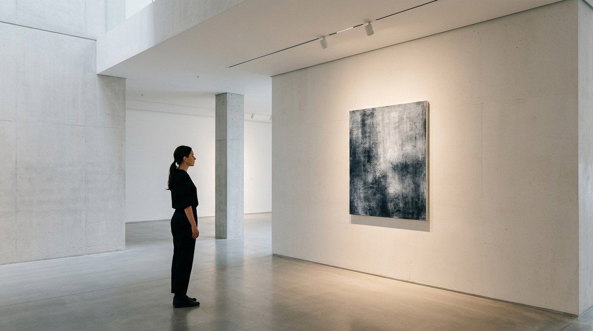
Walk into a gallery where the light feels wrong and you notice it immediately. Harsh shadows cut across a painting. A sculpture casts an awkward glare. Visitors squint or step back to find a better angle. Good lighting should never call attention to itself. In a minimalist space, the goal is even simpler: the light disappears so the art can speak.
The best gallery lighting does not compete. It reveals texture, depth, and color without drama or distraction. For curators and designers working with a minimalist aesthetic, every fixture, beam angle, and color temperature choice matters. Get it right and your visitors will linger. Get it wrong and they will move on without ever really seeing the work.
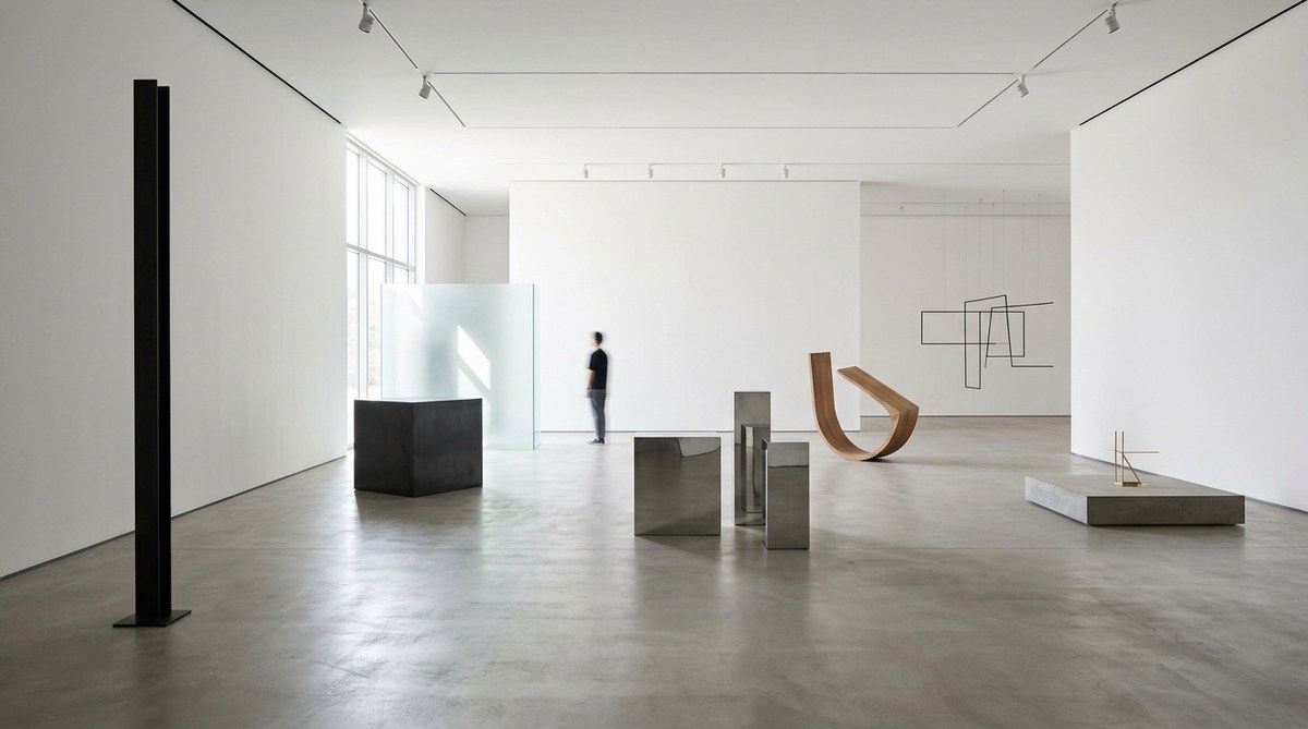
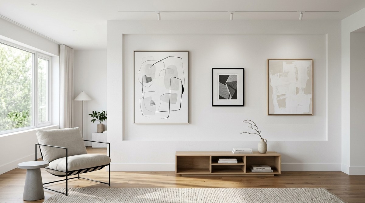
Minimalist gallery lighting design is about subtraction, not addition. Use track systems with adjustable heads to direct light precisely where it belongs. Choose a color temperature between 3000K and 3500K for a warm neutral glow. Keep fixtures hidden or choose designs that blend into the ceiling. Layer ambient and accent light to create depth without clutter. By reducing visual noise, you let each artwork occupy its own quiet moment.
Why Minimalist Lighting Works for Modern Galleries
Minimalism is not about having less for the sake of it. It is about making room for what matters. In a gallery context, that means clearing away visual clutter so the art takes center stage. Hanging pendant lights with visible cords, bulky track heads, and mismatched color temperatures all compete for attention. They add noise.
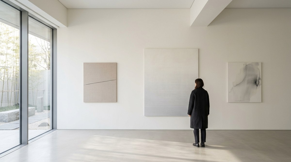
When you apply minimalist gallery lighting design, you remove that noise. The ceiling becomes clean. The walls feel expansive. Visitors enter a room and immediately settle into a calmer state of mind. That shift matters because it changes how they look at art. A relaxed viewer spends more time with each piece. They notice brushstrokes, textures, and subtleties they might otherwise miss.
The trend toward minimalist lighting is not a passing style. It reflects a deeper understanding of how light shapes human perception. In 2026, galleries across the United States are moving toward cleaner installations. White ceilings, recessed fixtures, and linear systems that disappear into architecture are becoming standard. The result is a viewing experience that feels intentional and peaceful.
The Core Principles of Minimalist Gallery Lighting Design
Before you change a single bulb, understand the principles that guide every decision.
- Subtract before you add. Start with the minimum number of fixtures needed. Then remove one more. See if it still works.
- Hide the source. Visible hardware distracts. Recessed lights, cove lighting, and track systems with slim profiles keep attention on the art.
- Control the beam. Wide floods wash walls evenly. Narrow spots highlight individual pieces. Use both intentionally.
- Match color temperatures. Every fixture in a room should share the same Kelvin rating. Mixed temperatures look sloppy.
- Respect the surface. Different materials react to light differently. Oil paint, acrylic, canvas, metal, and glass each need a unique approach.
These five rules form the backbone of any successful installation. They apply whether you are lighting a single photograph or a 2,000-square-foot exhibition hall.
Common Mistakes and How to Avoid Them
Even experienced curators make errors. Here is a breakdown of the most frequent problems and the solutions that fix them.
| Mistake | Why It Happens | How to Fix It |
|---|---|---|
| Overlighting the room | Fear that art will look dull | Use lower wattage and layer light sources |
| Mixed color temperatures | Using leftover fixtures from different eras | Standardize on 3000K to 3500K across the space |
| Harsh shadows on frames | Lights aimed too close to the wall | Increase the distance between fixture and wall |
| Glare on glass frames | Angle of incidence equals angle of reflection | Adjust the beam angle or use anti-glare lenses |
| Visible cables and tracks | Functional choices made without design consideration | Choose low-profile or recessed track systems |
Addressing these issues does not require a renovation budget. Sometimes the fix is as simple as swapping a bulb or moving a track head by six inches.
A Practical Process for Installing Minimalist Lighting
Let us walk through a real world approach. Imagine you are preparing a new exhibition in a 1,200-square-foot gallery with white walls, a white ceiling, and concrete floors. You have five paintings and three sculptures to install. Here is a step by step process.
-
Map the art placement first. Decide exactly where each piece will hang or sit. Mark those positions on the floor plan. Do not choose lighting until you know the layout.
-
Determine the beam angle for each piece. A 15-degree spot works for a small painting. A 40-degree flood suits a larger canvas or a sculpture. Match the beam to the size of the artwork.
-
Select your fixtures. Choose a single track system with adjustable heads. Keep all heads the same model and finish. Matte white or black heads blend into most ceilings.
-
Position the tracks. Run tracks parallel to the longest wall. This gives you flexibility to move heads as exhibitions change. Keep tracks at least two feet from the wall for an even wash.
-
Aim and test. Turn on all lights at once. Walk the room. Look for hot spots, dark corners, and reflections on frames. Adjust each head until the light falls evenly on the art.
-
Add ambient light if needed. Use cove lighting or a dimmable wall wash to bring the room to a comfortable baseline. Ambient light should never compete with accent light.
-
Dimmer everything. Install dimmers on every circuit. The ability to adjust brightness during installation and throughout the day is essential.
This process takes a few hours, but the results are immediate. Visitors will feel the difference the moment they step through the door.
Choosing the Right Fixtures for a Minimalist Look
Not all lighting fixtures fit a minimalist aesthetic. Look for products that prioritize simplicity in form. Recessed adjustable downlights are a strong choice because they sit flush with the ceiling. Linear LED systems offer clean lines and even distribution. Surface-mounted track with ultra-slim profiles works well when recessed options are not available.
Avoid fixtures with decorative details. Visible bulbs, ornate brackets, and colored housings add visual noise. If the fixture itself draws attention, it fails the minimalist test. The goal is a ceiling that feels quiet and open.
Color rendering is another critical factor. Look for fixtures with a CRI (Color Rendering Index) of 90 or higher. A high CRI ensures that reds look red, blues look blue, and skin tones stay natural. Low CRI lighting makes art look flat and lifeless.
In 2026, the best minimalist fixtures also consider sustainability. LED systems with long lifespans and low energy consumption reduce maintenance and environmental impact. Some manufacturers now offer fixtures with replaceable modules rather than sealed units. That makes repairs easier and keeps fixtures out of landfills.
How Light Affects Different Art Mediums
Every material responds to light in a unique way. Understanding these differences helps you make better choices.
Oil paintings benefit from warm light around 3200K. The warmth brings out the richness of the pigment and reduces glare from impasto texture. Aim the light at a 30-degree angle to avoid casting shadows from the frame.
Works on paper, including photographs and prints, need cooler light around 3500K to maintain sharpness. These pieces are also sensitive to UV damage. Use fixtures with minimal UV output to protect archival materials.
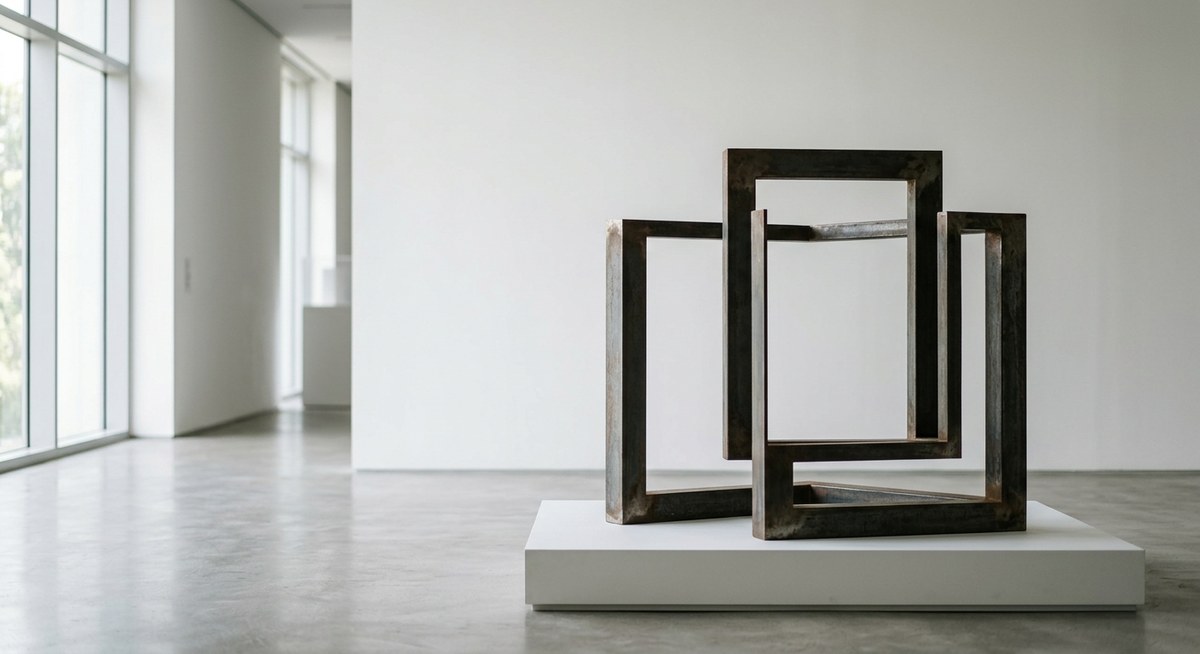
Sculptures require light from multiple angles. A single source creates harsh shadows. Position two or three spots around the piece to reveal form and volume. For metal sculptures, watch for specular highlights. Diffusing the light slightly can reduce unwanted reflections.
Textile art absorbs light instead of reflecting it. You need more lumens to achieve the same perceived brightness. Increase the wattage or add a second fixture to ensure the piece reads clearly.
Mixed media installations often combine several of these challenges. The best approach is to test each material separately before finalizing your setup.
Expert Advice from a Gallery Lighting Specialist
“The biggest mistake I see is trying to light every piece the same way. A painting and a sculpture are not the same object. Treat each artwork as its own problem to solve. If you walk into a room and every fixture is aimed at the same angle, you have not designed lighting. You have just installed bulbs.” – Sarah Lin, lighting consultant for galleries and museums
Sarah works with galleries across the country to improve their exhibition lighting. Her philosophy is rooted in minimalism: use fewer lights, place them with care, and always prioritize the art over the hardware.
She recommends that gallery owners schedule a lighting audit at least once a year. Walk through the space with a notebook. Note which pieces feel flat, which ones produce glare, and where shadows fall. Then adjust accordingly. Small changes can transform the entire room.
Bringing Minimalist Lighting into Smaller Spaces
Not every gallery has a high ceiling or a huge budget. Small galleries, pop-up spaces, and home studios can still apply minimalist gallery lighting design principles on a smaller scale.
Battery-powered track systems are an option for temporary installations. They mount with adhesive and require no wiring. The quality has improved dramatically in recent years. Some models now offer high CRI and dimmable controls.
Floor lamps with adjustable arms can light a single piece without touching the ceiling. Choose a simple design in black or white. Avoid lamps with visible cords if possible, or use cord covers painted to match the wall.
Clip-on spotlights are the most basic option. They work well for a single painting in a corner. Just make sure the beam is narrow enough to avoid spilling onto adjacent walls.
Even with limited resources, the same principles apply. Reduce visual clutter. Match color temperatures. Use dimmers. The investment is small, but the payoff in viewer experience is real.
Trends Shaping Minimalist Gallery Lighting in 2026
The lighting industry continues to evolve. Here are three developments worth watching.
First, tunable white LED systems are becoming more accessible. These fixtures allow you to adjust color temperature on the fly. You can set the room to 3000K for a warm evening reception and 3500K for a daytime viewing. The flexibility is useful for galleries that host a variety of events.
Second, wireless controls are replacing traditional wall switches. With a smartphone app, you can adjust every fixture in the gallery from anywhere in the room. That makes it easier to test different setups without climbing a ladder.
Third, manufacturers are designing fixtures with sustainability in mind. Modular components, recyclable materials, and longer lifespans are becoming standard. Galleries that prioritize environmental responsibility can now find products that align with their values.
These trends support the minimalist philosophy. They remove friction, reduce waste, and give curators more control over the viewing experience.
Integrating Lighting with the Broader Gallery Design
Lighting does not exist in isolation. It works together with wall color, floor material, ceiling height, and furniture placement. A minimalist approach treats the entire room as a cohesive system.
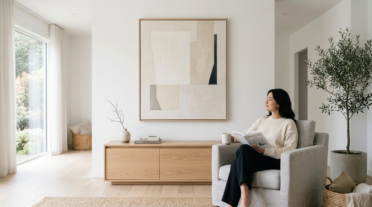
White walls reflect light efficiently. They also provide a neutral backdrop that lets art colors pop. If your walls are painted in a warm white, choose warmer lighting. If they are cool white, lean toward the higher end of the Kelvin range.
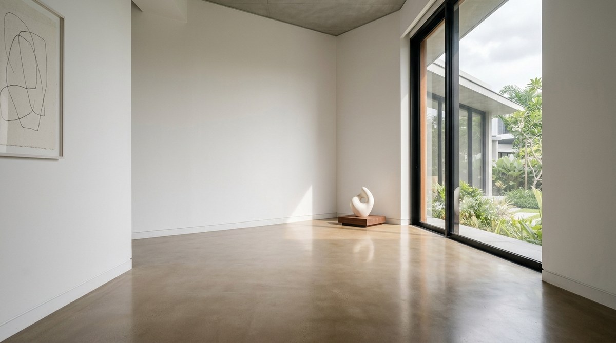
Floors matter too. Polished concrete reflects light upward, which can create unwanted ambient glow. Matte finishes absorb more light and keep the focus on the art. If your floor is reflective, adjust your aiming angles to compensate.
Ceiling height determines the spread of your beam. Higher ceilings require narrower beam angles to keep light concentrated on the artwork. Lower ceilings allow wider beams but increase the risk of glare.
For more ideas on how to create a harmonious environment, read about creating harmonious art spaces with minimalist design principles. That piece covers how lighting, furniture, and wall treatments work together.
A Final Look at the Viewer Experience
At the end of the day, minimalist gallery lighting design serves one purpose: to help people see art clearly and feel good while doing it. When the light is right, visitors relax. They slow down. They notice things they might have missed.
Think about the last time you stood in front of a painting that truly moved you. Chances are the lighting was excellent. You did not think about the fixtures. You did not notice the beam angle or the color temperature. You just saw the art.
That invisible quality is the mark of a successful installation. The hardware disappears. The room breathes. And the artwork steps forward into its own quiet space.
If you are unsure where to start, begin with one room or even one wall. Apply the principles listed here. Test different angles. Ask a colleague to walk through and share their honest impressions. Small adjustments can produce dramatic results.
You might also find inspiration in the art of light and space in minimalist interior design. That article explores how light shapes perception in broader interior contexts. Many of the same ideas apply directly to gallery settings.
Making Minimalist Lighting Work Season After Season
Galleries change. Exhibitions rotate. Artwork comes and goes. Your lighting system needs to adapt without losing its minimalist integrity.
Invest in flexible infrastructure from the start. Track systems with movable heads give you the freedom to reconfigure quickly. Dimmers let you adjust the mood for each new show. A well-designed system should last for years with only minor tweaks.
Keep a log of your lighting setups. Take photos of each configuration. Note which angles worked and which did not. Over time, you will build a reference library that saves hours of trial and error.
When you install a new exhibition, revisit the basics. Walk the room. Look for glare, shadows, and hot spots. Adjust accordingly. The process becomes second nature after a few cycles.
For a deeper look at how simplicity shapes modern installations, check out the impact of object simplicity on modern art installations. That article connects the dot between minimalist objects and the spaces they inhabit.
Your Next Step
Pick one piece of art in your gallery right now. Stand in front of it. Look at how the light falls. Is there a shadow across the frame? Does the color look true? Can you see the texture clearly? If something feels off, adjust the fixture. Move it closer, farther, or to a different angle. See what happens.
That single act of attention is the heart of minimalist gallery lighting design. It does not require expensive equipment or a full renovation. It just requires care.
The next time you walk into your gallery, look at the light first. Then look at the art. If you cannot tell where one ends and the other begins, you have done your job well.

Leave a Reply